
Overview
According to the feedback received by our users, we defined our premise to start a design sprint:
"The current Electronic Health Record is too difficult to use"
Role
Design Director | Huli
User research, Information Architecture, Interaction, Visual design, Prototyping & Testing.
Team of 3 designers & 10+ developers
Jan 2017 - May 2017

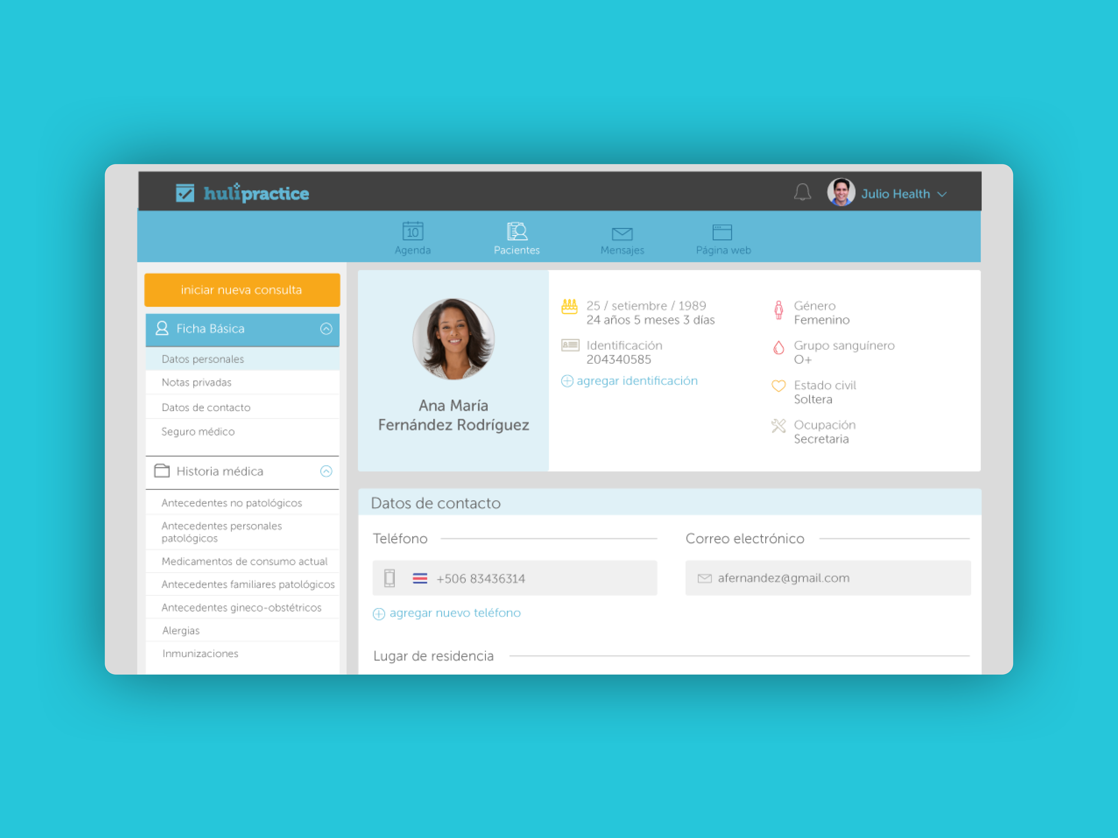
Electronic Health Record before the redesign.
A close up to the old Electronic Health Record
Our goal was to improve the usability of the current product. There were a lot of pain points such as bad performance, accessibility of components and the learnability of different features.
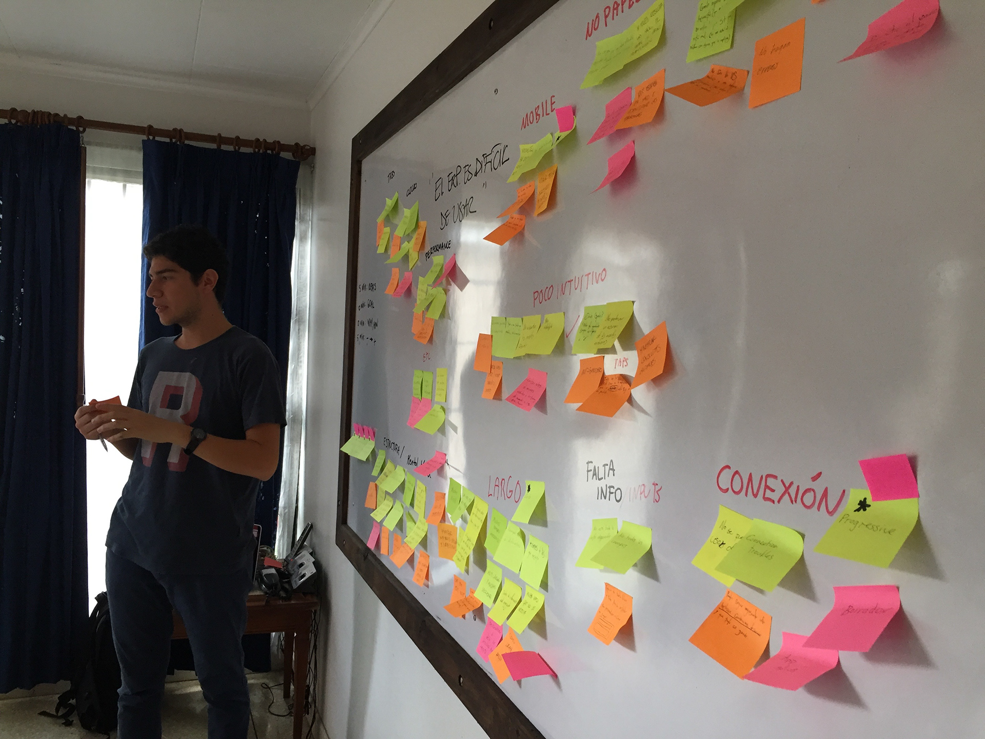
Discovery, Research, & Design Sprint.
We get together an interdisciplinary team, including members from sales, customer success, management, development, and design.
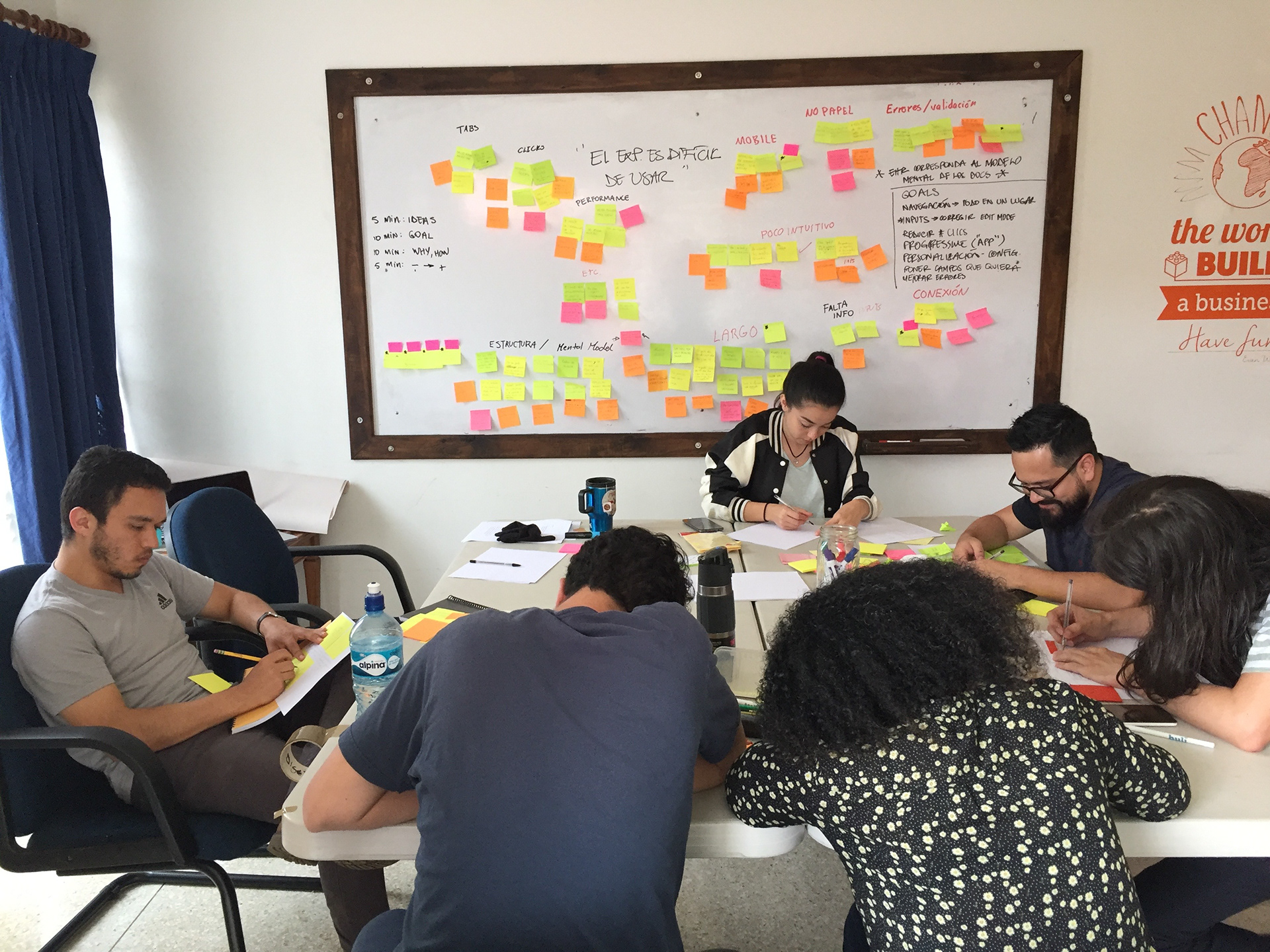
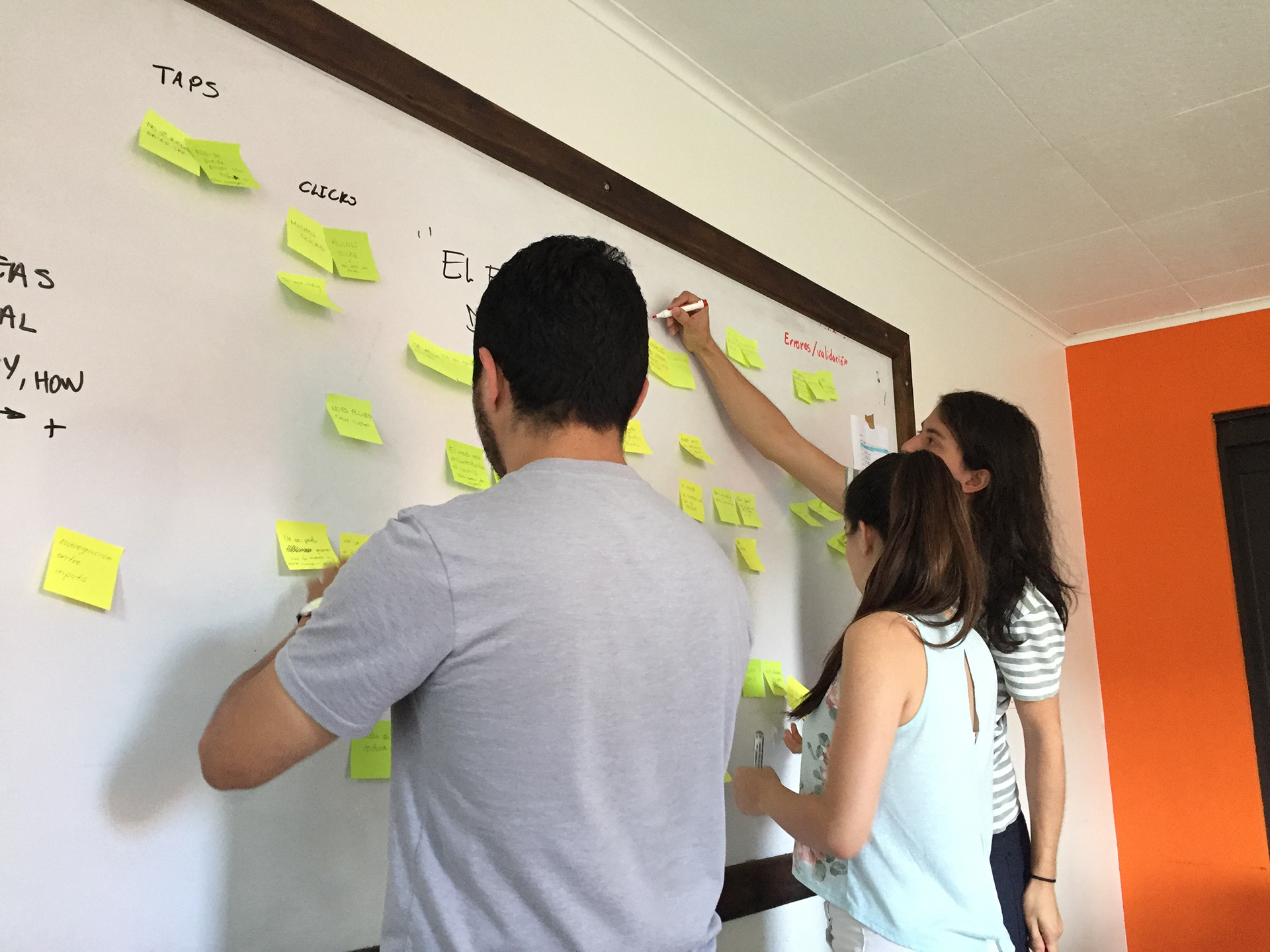
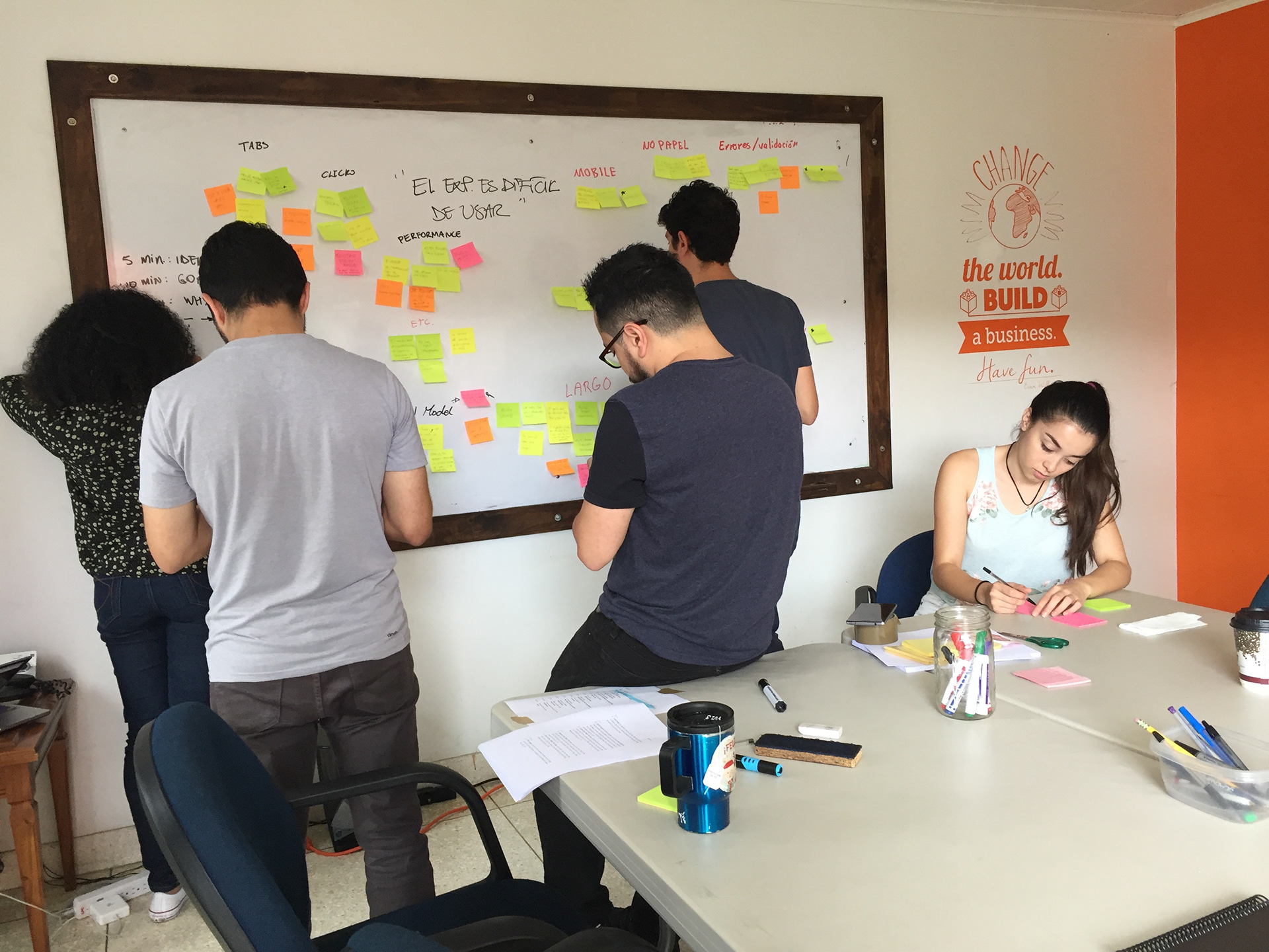
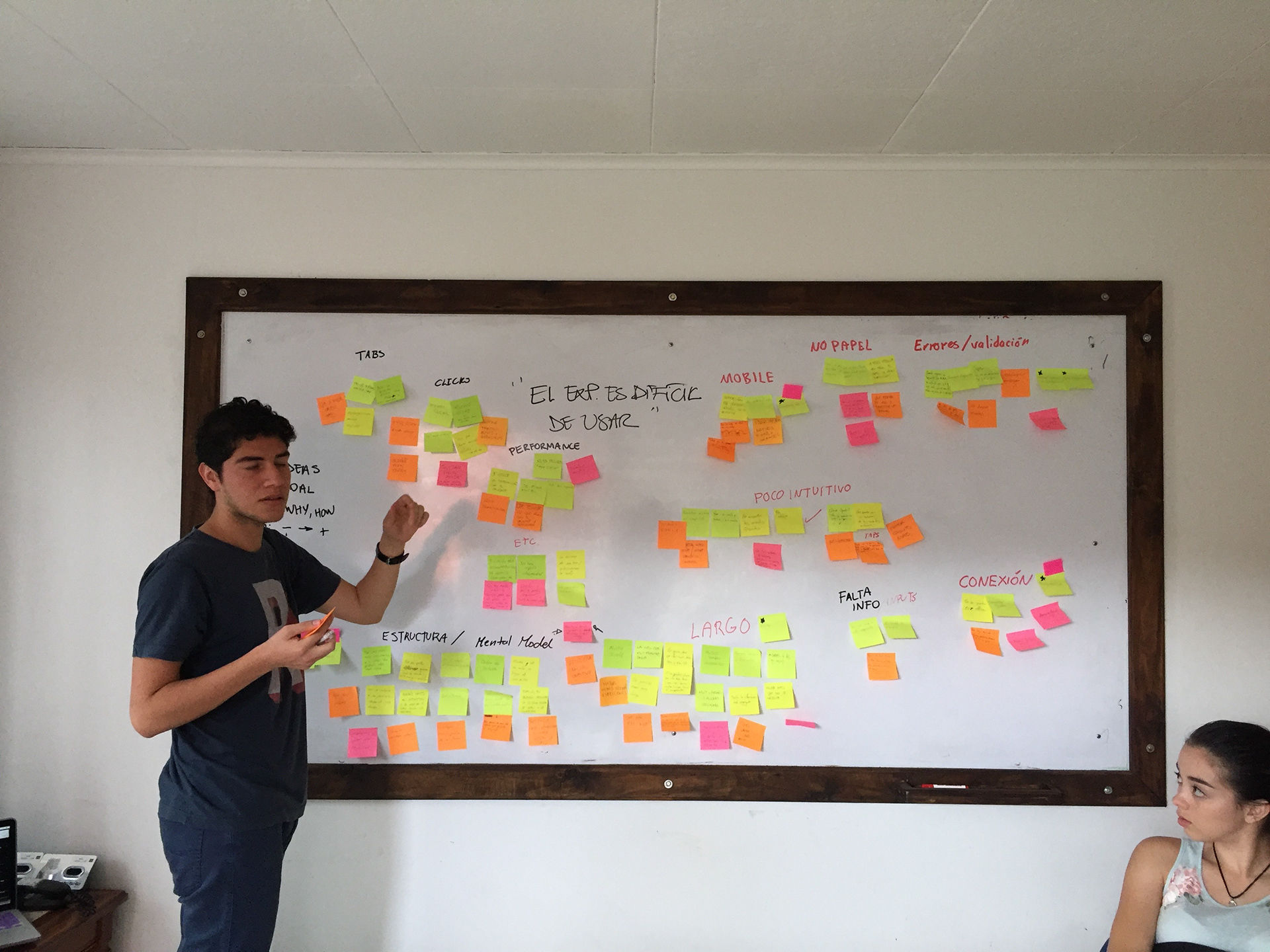
User Pain Points
We identified the following improvement areas for the Electronic Health Record, based on users feedback:
- Tabs (navigation).
- Clicks (quantity).
- Performance.
- Structure and doctors mental model.
- Screen height (scroll).
- Inputs usability.
- Connectivity (offline version).
- Errors and validations.
- Flexibility vs paper.
- Mobile version (optimization).
- Not intuitive.
The Challenge
How might we improve the usability and interaction of the Electronic Health Record to make it easier to enter data, and adaptable to our customers' mental models?
Teamwork
The team was always involved in every critical decision. Collaboration is our key to achieve a common goal and complete our task most effectively and efficiently.
The Concept
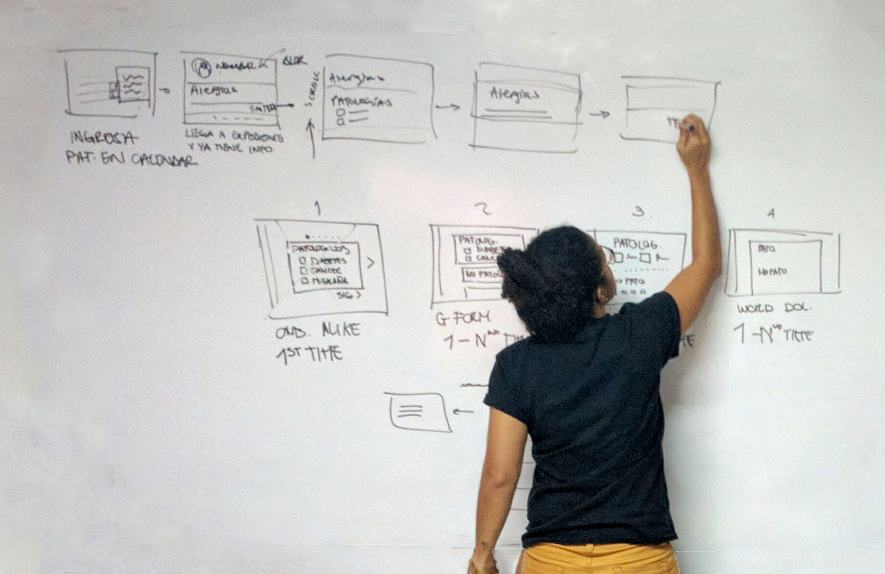
To start conceptualizing our ideas, we always start to sketch possible solutions (separately) to attack the previously identified problems.
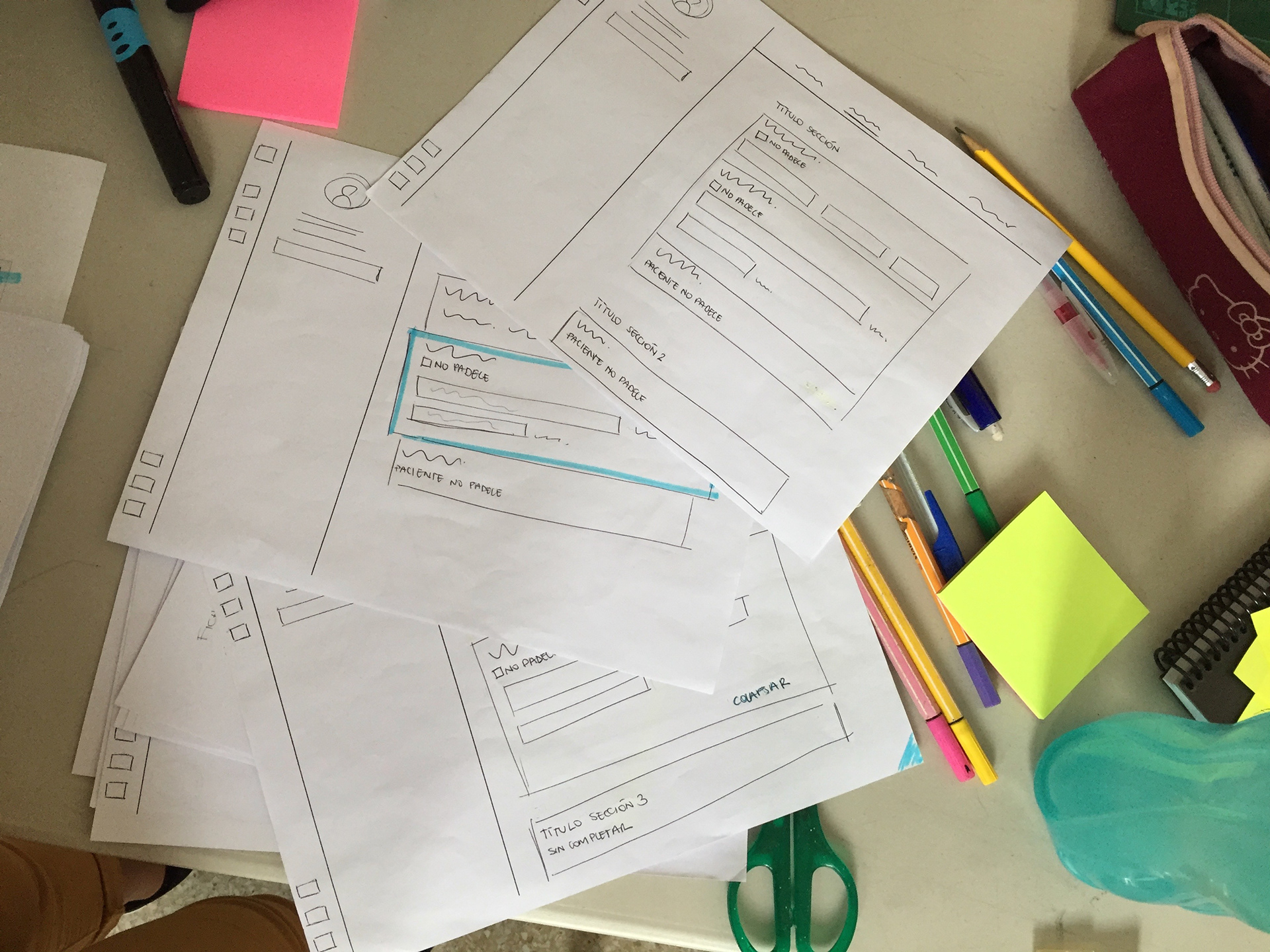
Ideation
Part of the process is to have as many ideas as possible and then evaluated them.
This helps us to choose a way and got all the team on board with the decisions we make later.
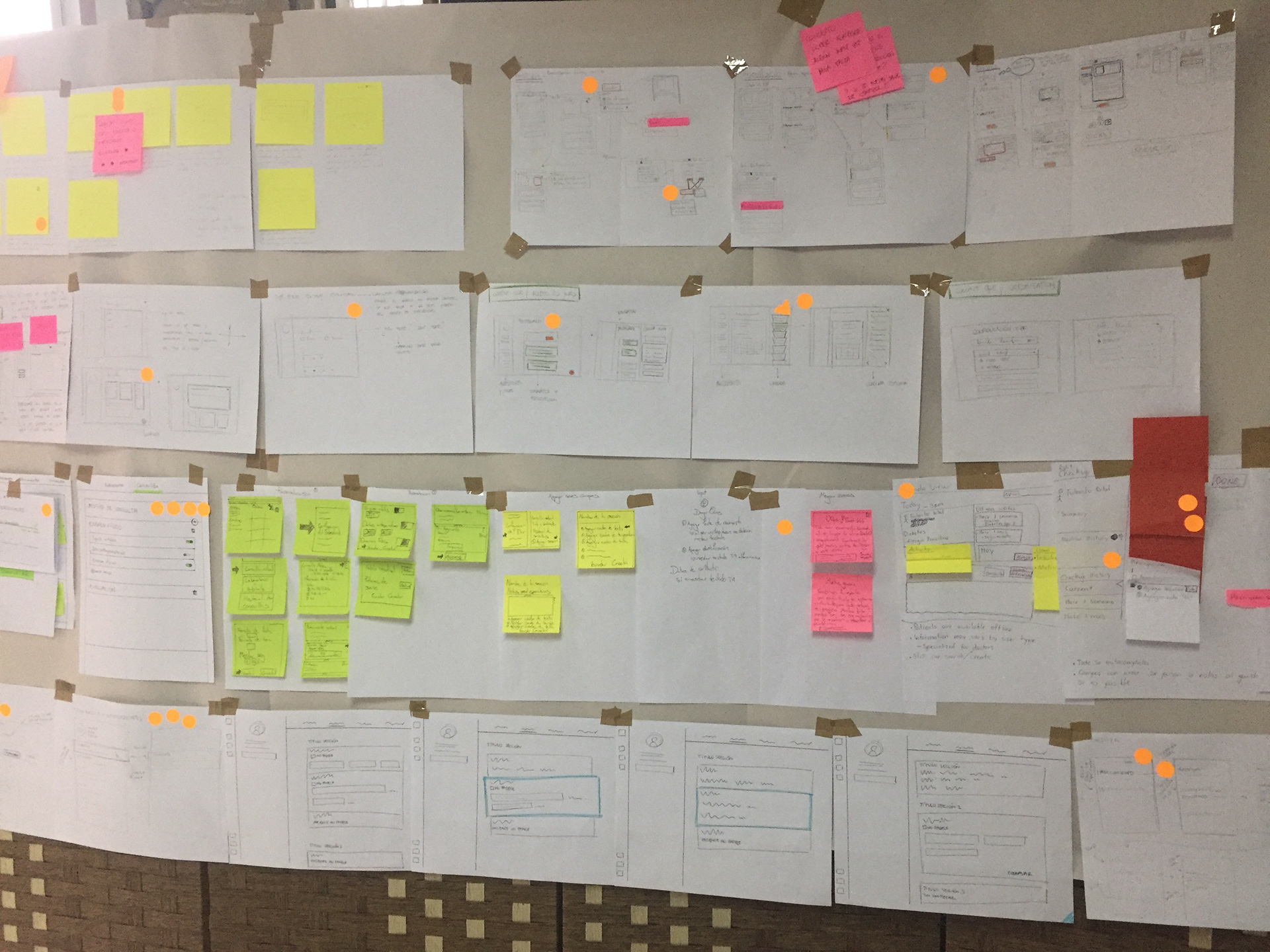
Agreements
- We decided to use a concept similar to Google Form and Typeform to enter the information.
- We made two prototypes to test two different concepts.
- Medium was a reference for a clean UI, using the concept of a blank sheet.
There were other very good ideas but they were out of scope, therefore remain pending to investigate further.
Usability Testing
We tested the product at various stages of the project.
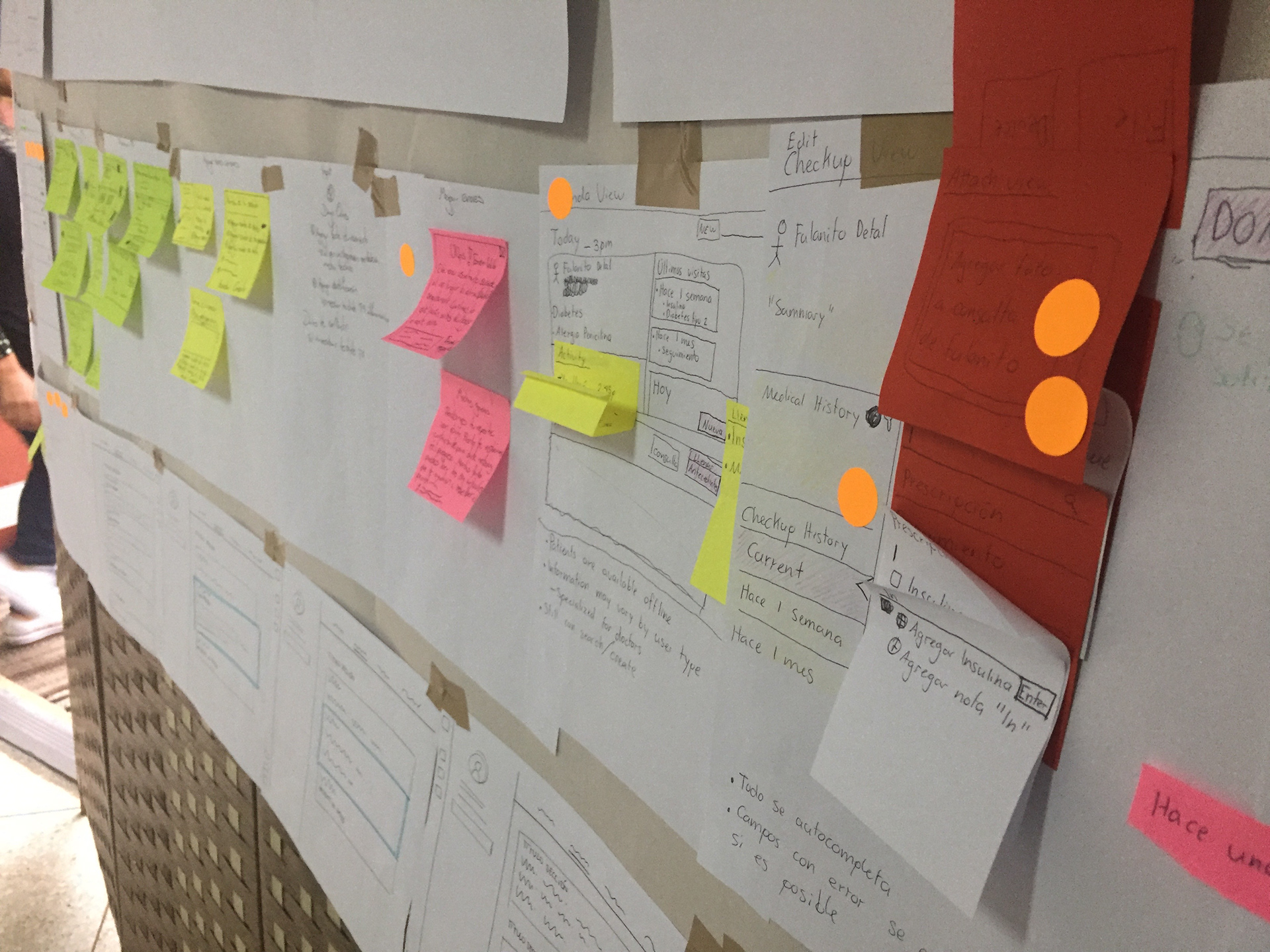
Lo-fi prototypes
Several paper prototyping were tested with the stakeholders weekly to get feedback on the functionality, content, and interactivity of the product.
Hi-fi prototypes
Two prototypes were generated according to the concepts and sketches of the design sprint.
For both prototypes, only 3 sections of the file were made from the medical record:
- Non-pathological medical history.
- Personal medical history.
- Medications.
- Non-pathological medical history.
- Personal medical history.
- Medications.
The objective, with both prototypes, was to identify patterns of use in users when entering data.
We also validated:
- Nomenclature.
- Navigation between components.
- Component functionalities.
- General feedback of the current Electronic Medical Record.
- Nomenclature.
- Navigation between components.
- Component functionalities.
- General feedback of the current Electronic Medical Record.
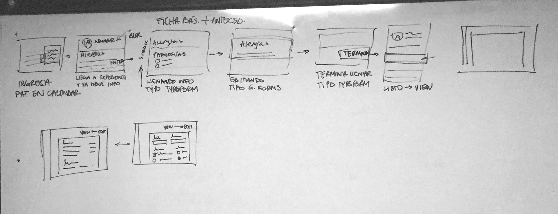
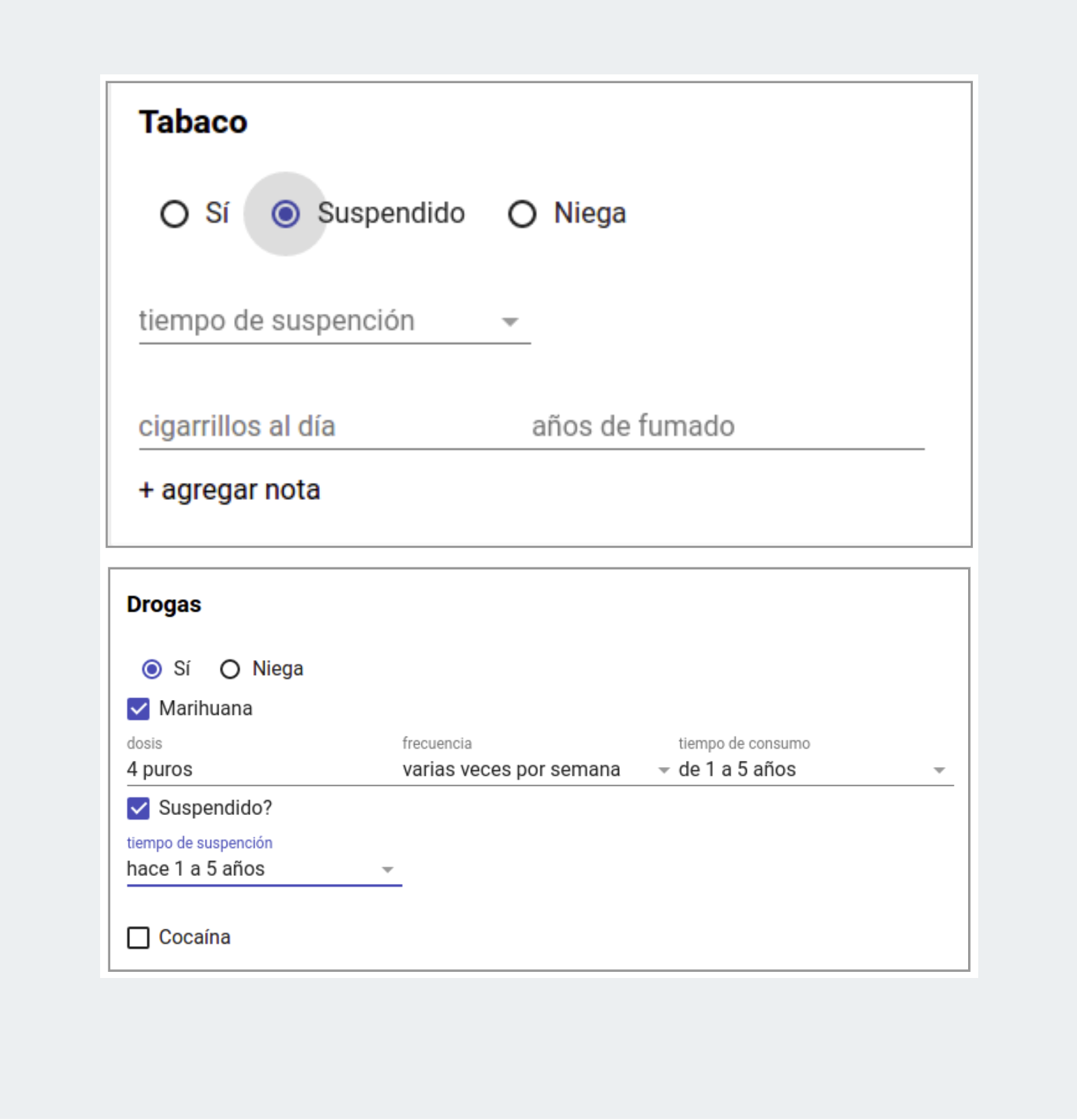
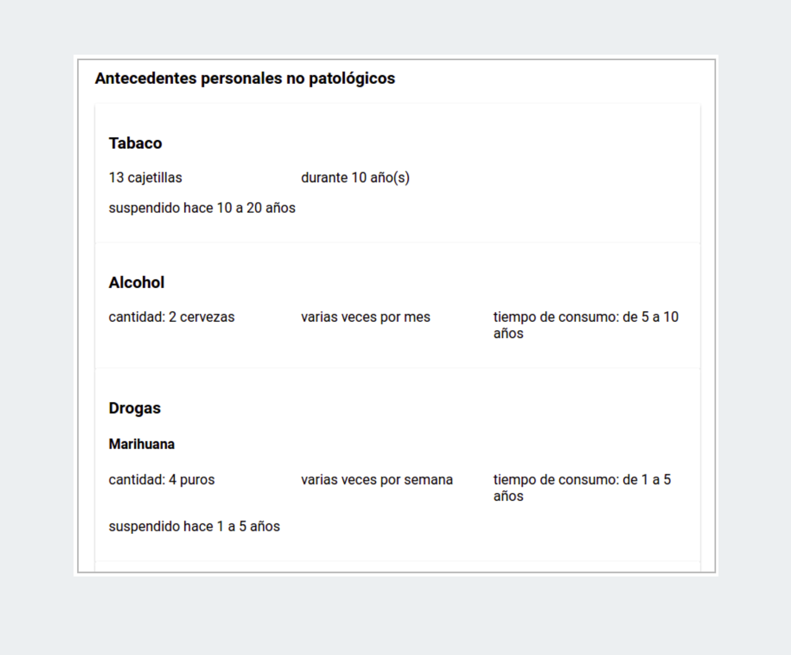
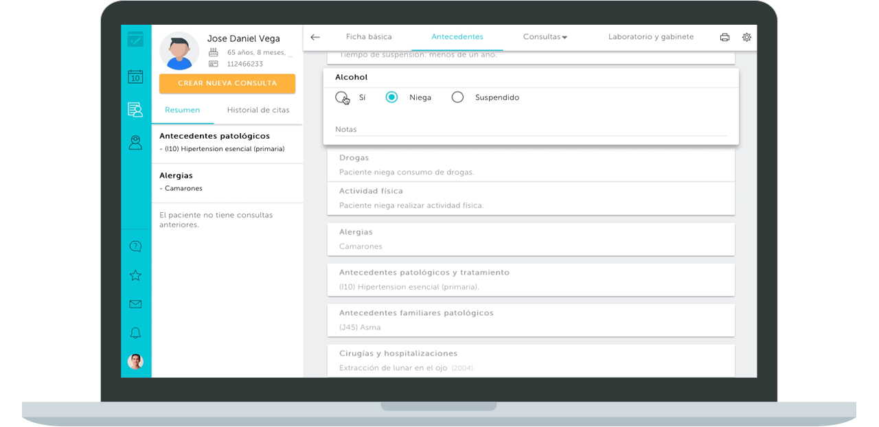
Prototype concept: Google Form
The idea was to generate a prototype that resembles certain behaviors of a Google form.
Polymer was used to develop the prototype.
Relevant behaviors:
- Editable mode
- View summary mode
- Editable mode
- View summary mode
The first time the data is entered, each section has the options of Yes, No and Suspended according to the case.
Depending on the option that the user chooses, the fields referring to the selection will be displayed.
When finishing the edition the components go from "editable" to "view" mode. The user can re-edit the information at any time.
Only the information entered is shown.
Only the information entered is shown.

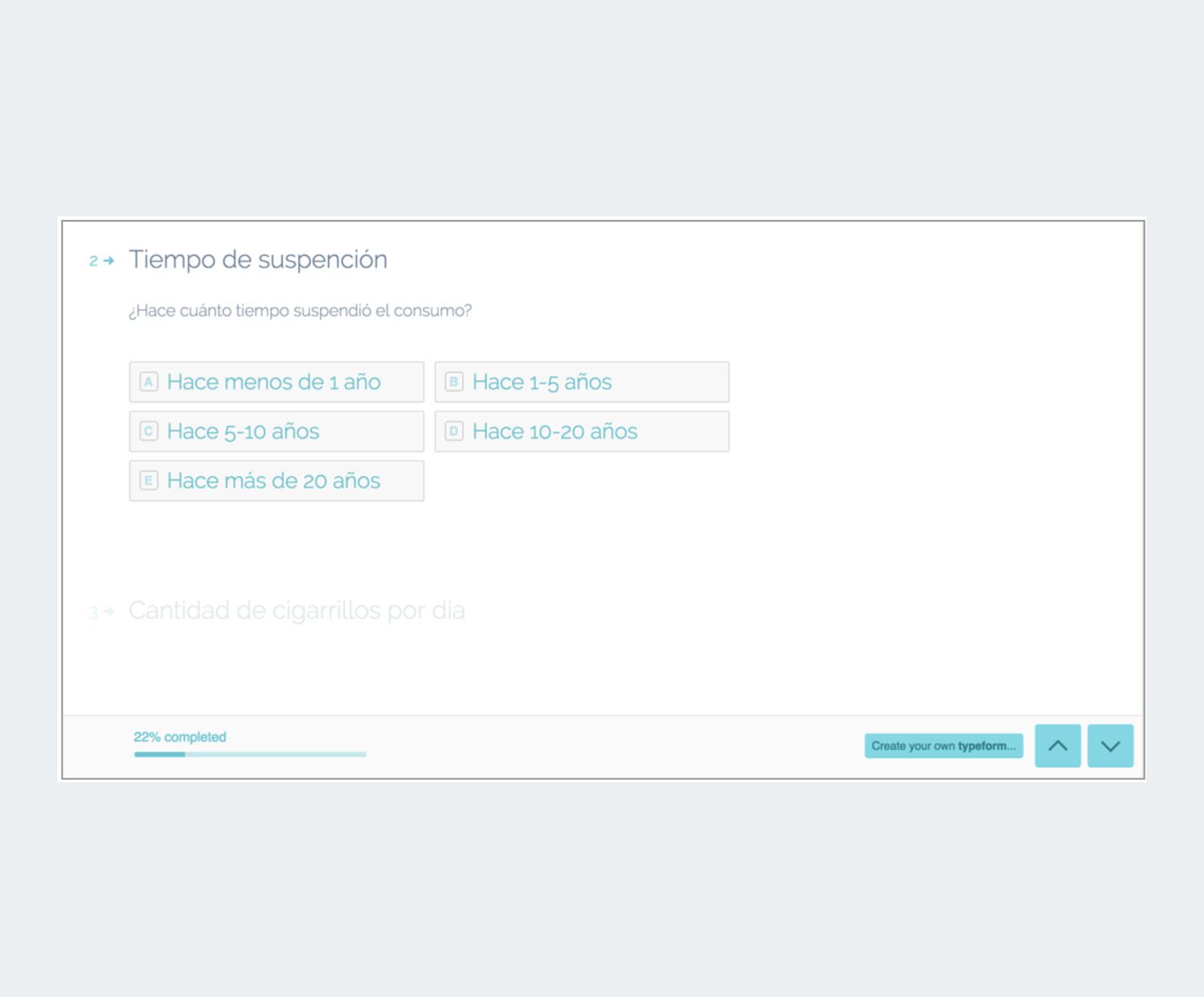
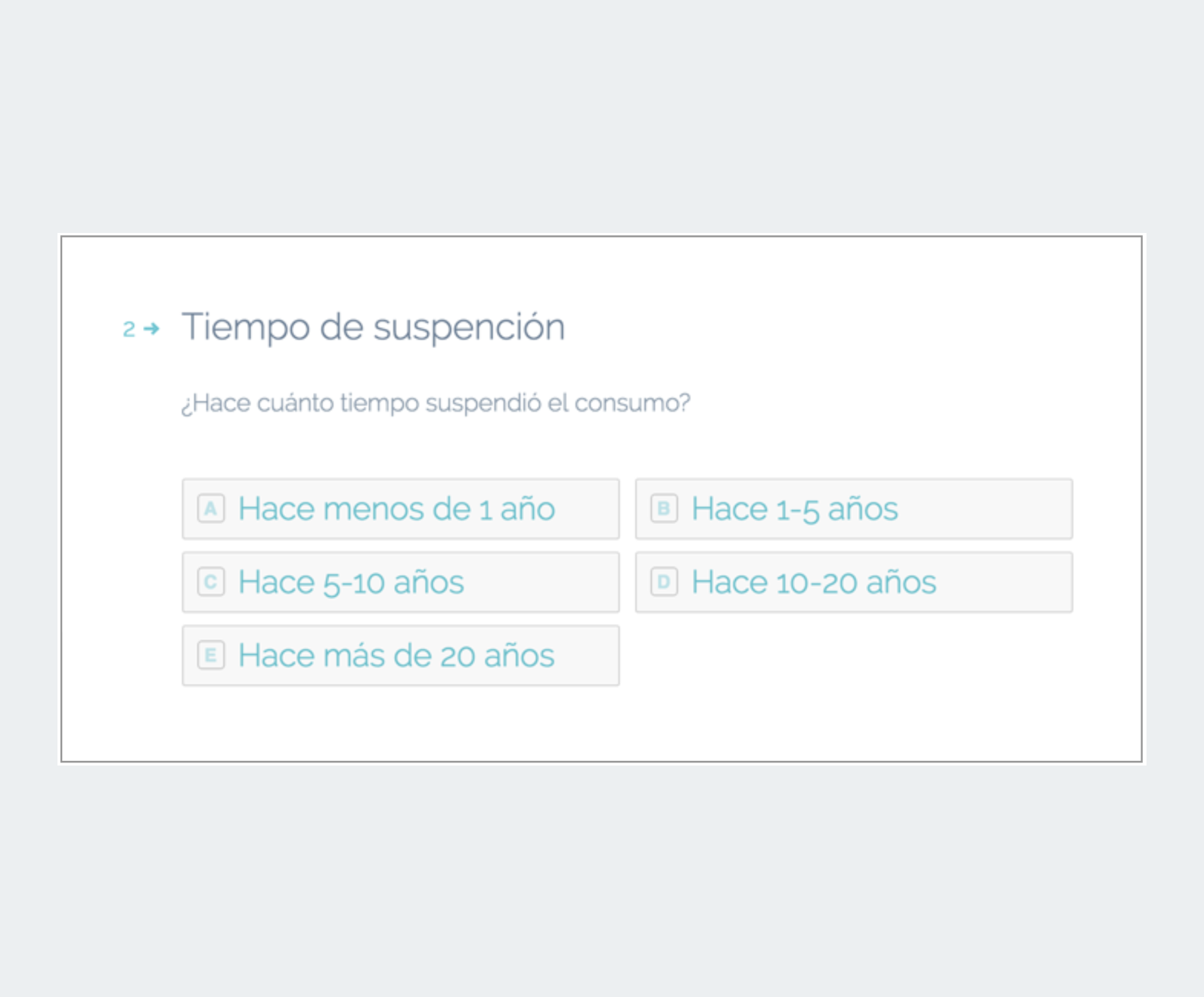
Prototype concept: Typeform
A Typeform form was designed as a prototype to validate the filling concept.
Relevant behaviors:
- Linear navigation, focusing on 1 question at a time.
- Onboarding.
- "Enter" behaviors to follow the next option.
- Shortcuts.
- Behavior of the "jumping" when changing question.
- Linear navigation, focusing on 1 question at a time.
- Onboarding.
- "Enter" behaviors to follow the next option.
- Shortcuts.
- Behavior of the "jumping" when changing question.
Usability Test Conclusions
Average time to complete test:
- G. Form concept: 4-6 min.
- Typeform concept: 4 min.
Typeform is a good option to enter patient information for the first time, but not to make changes or add new information.
Final Decision: G. Form concept.
. . .
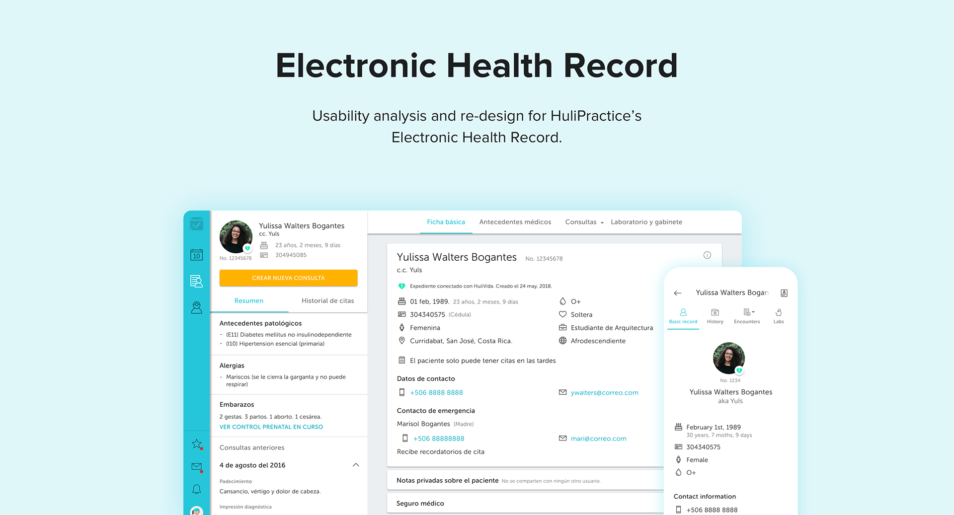
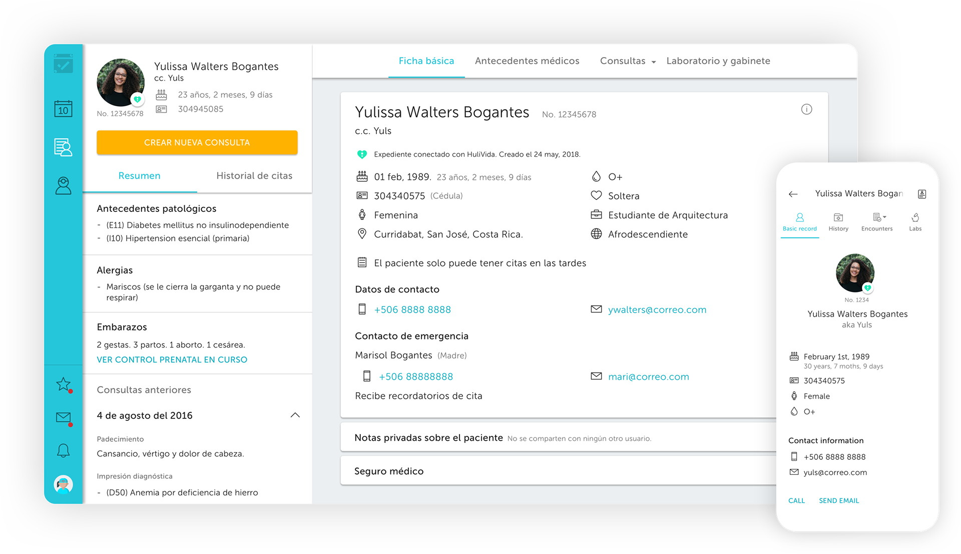
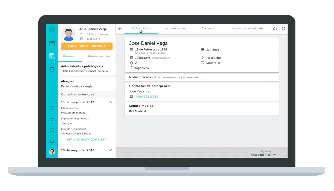
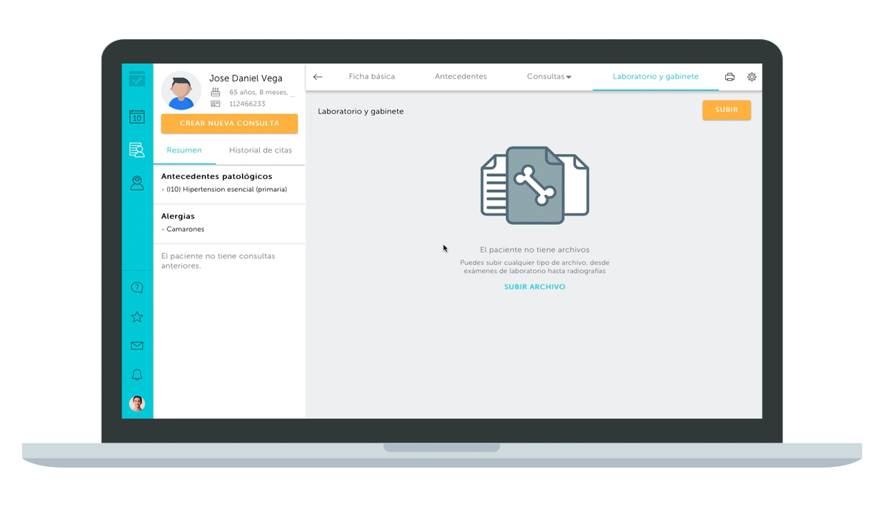
The New Electronic Health Record
The Result: A Delightful Experience
Main experience improvements:
- Optimization of usability for tablets and smartphones.
- Patient summary and appointment history.
- Easier and faster navigation.
- Tabs to navigate between sections.
- Shortcuts to navigate between fields by advancing with the "tab" (↹) and backward keys with the combination of "shift + tab" (⇧ + ↹).
- Automatic saving.
- Upload of multiple files at once.
- Faster charging speed.
- Improvements in accessibility.
- Improvement in performance and credibility.
Outcome
- Reduced churn (negative -1.2%)
- Increased retention
- Increased NPS (net promoter score)
- Increased customer satisfaction
- Reduced customer service calls
- New customers acquisition
- Increased up-sells
- Increased new sales
- Increased up-sells
- Increased new sales
🥇Award
Best global digital health startups (Google for Entrepreneurs 2017)
Best global digital health startups (Google for Entrepreneurs 2017)
Project Learnings
Listen to your users
The users are the experts of your product, they interact with it (hopefully) every day, they know best what their pain points are and what could be improved. Take the time to visit them and involve them in the process.
The users are the experts of your product, they interact with it (hopefully) every day, they know best what their pain points are and what could be improved. Take the time to visit them and involve them in the process.
Test, improve and test again
There is never the final solution, it always can be improved.
There is never the final solution, it always can be improved.
Empathy
You are not alone in this journey, developers and other team members of the company must visit customers as well. That creates empathy, not just in the users, but also in what you do and the value of it.
You are not alone in this journey, developers and other team members of the company must visit customers as well. That creates empathy, not just in the users, but also in what you do and the value of it.