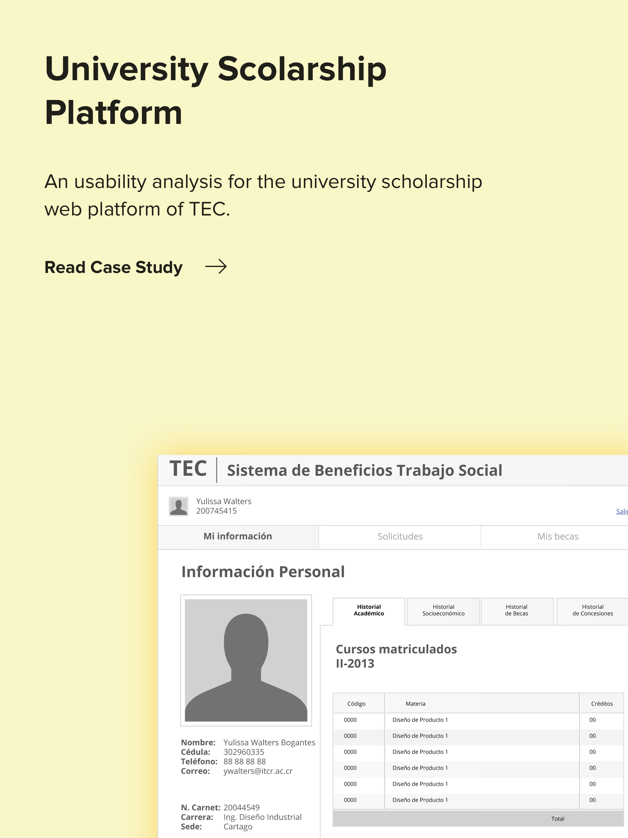

Overview
As Huli added more products and the team grew, it became crucial to maintain a consistent style and visual language across all sections of the platform. It was a team effort to create systematic ways to collaborate across all development and design teams, to deliver the best experiences to our users.
The outcome was a collection of reusable components, templates, and principles, that helps us to be consistent through all our different products.
Role
Team of 3 designers & 10+ developers
Oct 2016 - Dec 2016
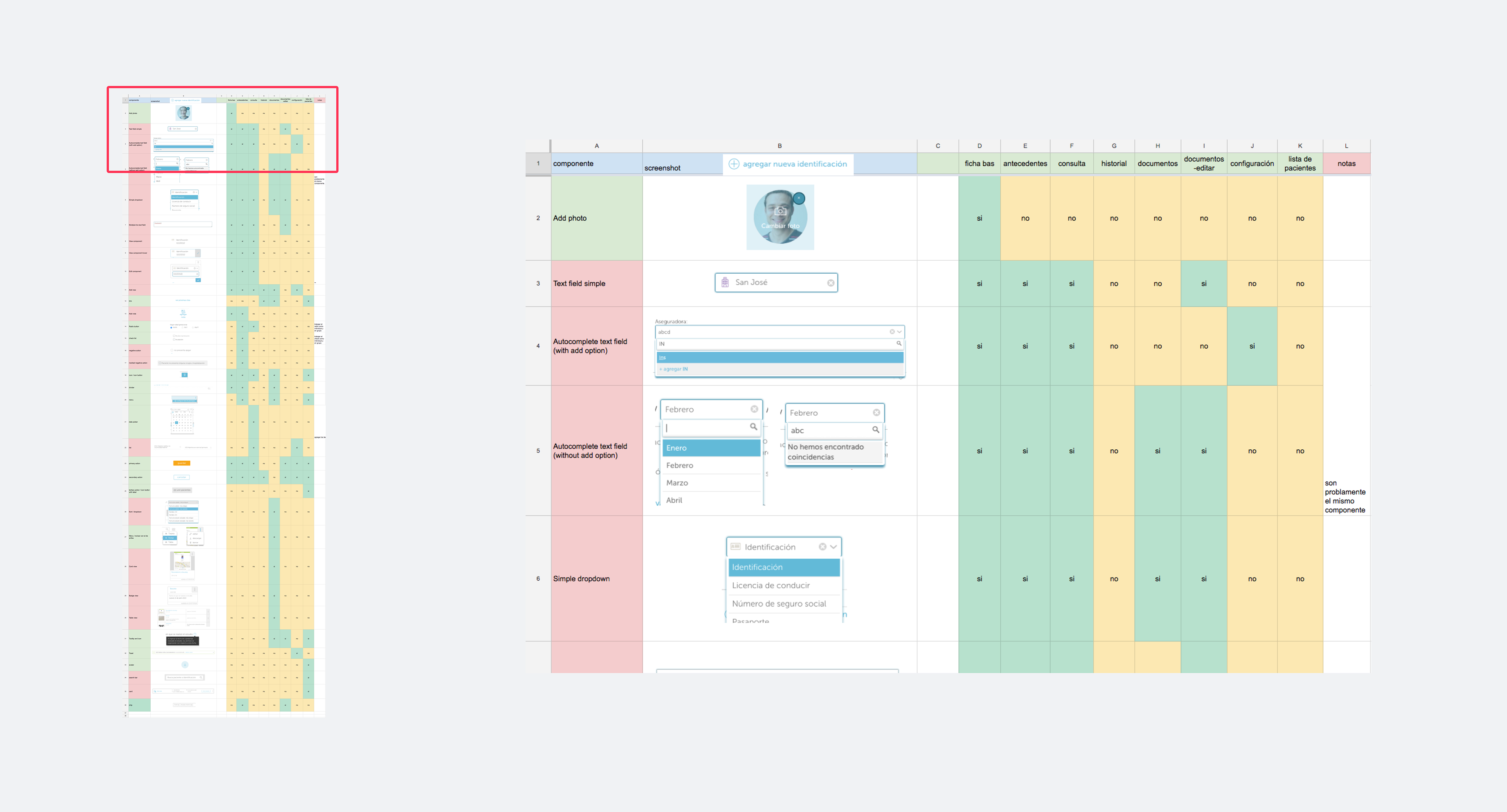
Content Inventory
We started with a content inventory of the main components that had issues and were difficult to use for the users. We also identified every section where each component was used.
Our goal was to improve usability in the new components at the same time we developed a ready-to-use design system that could be adapted to your individual product needs.
The Challenge
Getting everyone onboard
A Design System is about communication. The system should fit the culture of the team and the whole organization. It should become a natural part of the design process and evolve gradually with the team’s products, and for that, we need everybody on board.
A Design System is about communication. The system should fit the culture of the team and the whole organization. It should become a natural part of the design process and evolve gradually with the team’s products, and for that, we need everybody on board.
Planning & Priority
We had three months to create our Design System while we were analyzing and testing a new product. The team owned the challenge and kept sticky to plan until the end.
Involved our customers in the process
Although, we owned this change to our users and they were waiting for it. Yet, it was important to keep them involved and excited about the big changes we were planning. As a start, we asked for feedback and test with several of our customers and created a Private Beta for our key clients only.
Although, we owned this change to our users and they were waiting for it. Yet, it was important to keep them involved and excited about the big changes we were planning. As a start, we asked for feedback and test with several of our customers and created a Private Beta for our key clients only.
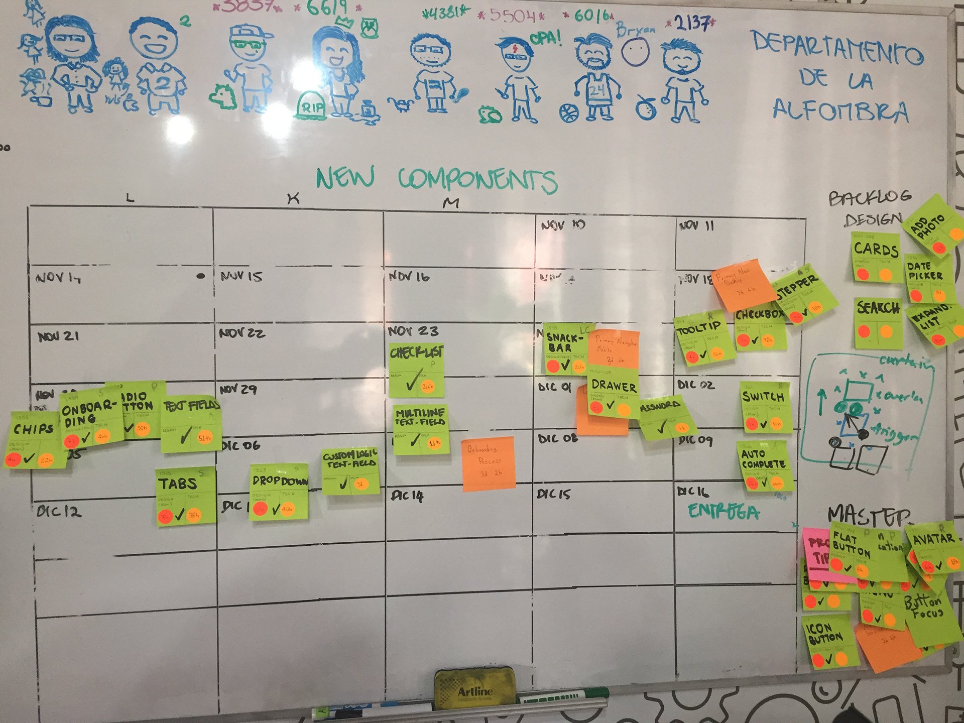
Teamwork
We created a schedule on the whiteboard to follow our progress and improve our collaboration.
It was a very hard deadline!
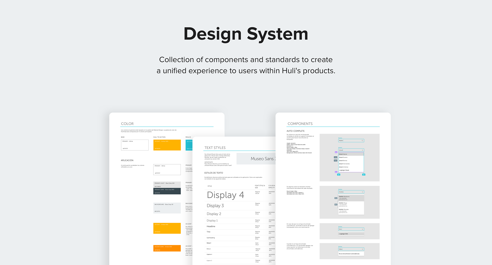
The Result: Our Design System
We built a design system to have a set of standards for design and code along with components that unify both practices.
New components and layouts were made to improve efficiency and usability to our new communication system.
Design & Collaboration Tools
- Sketch
- Zeplin
- Jira
References
- Atomic Design
- Material Design
We ended with more than 40 components!
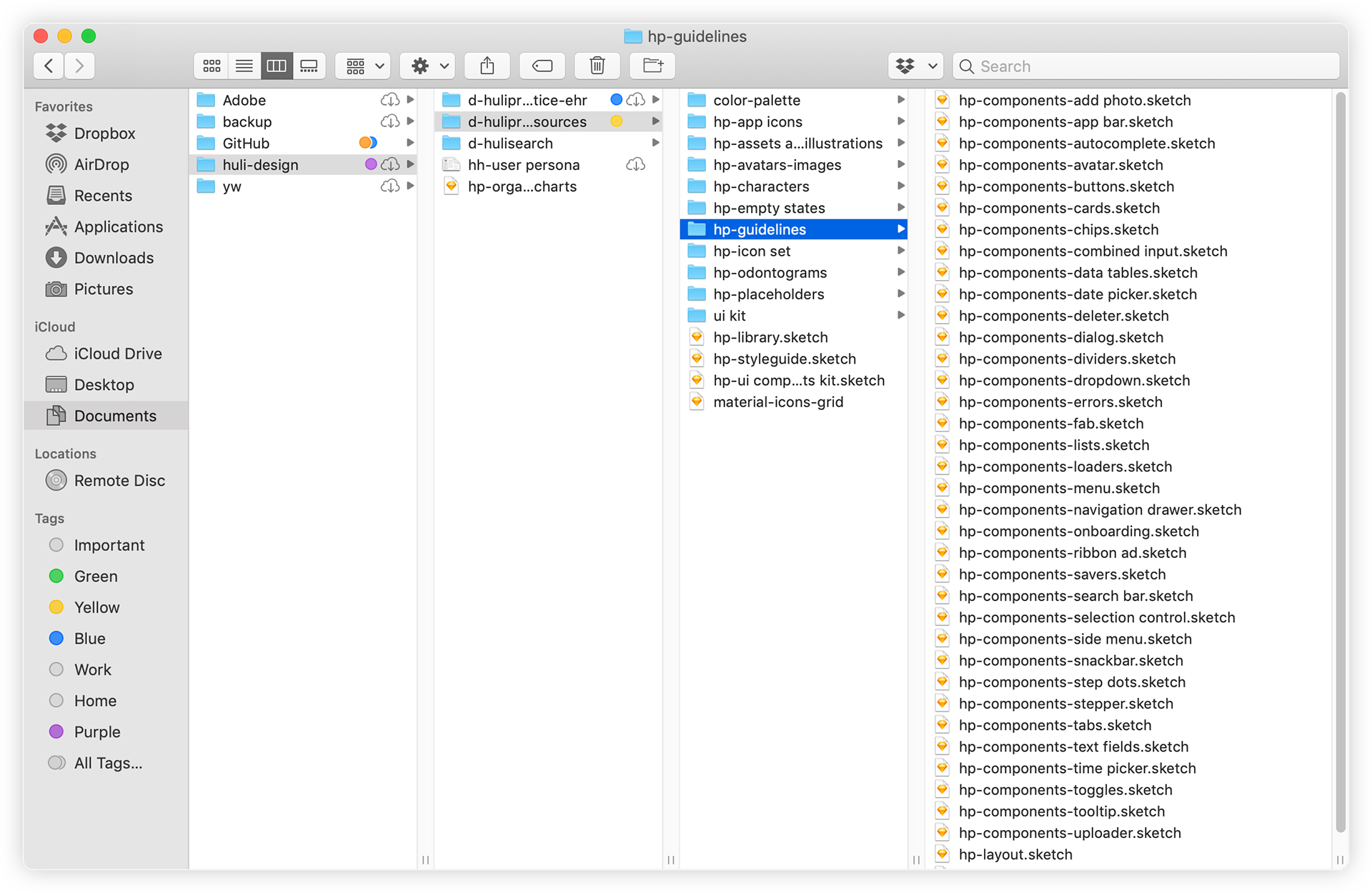
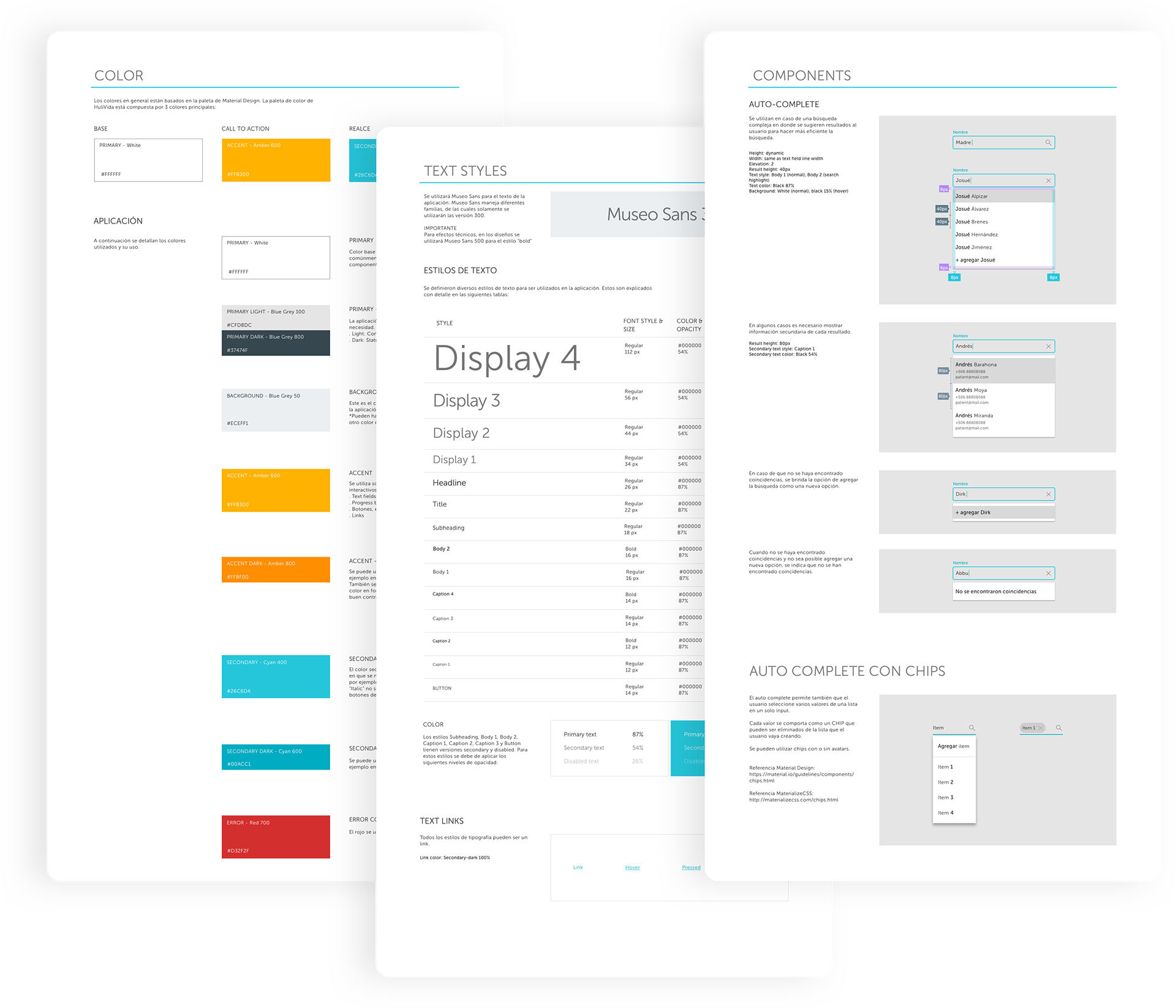
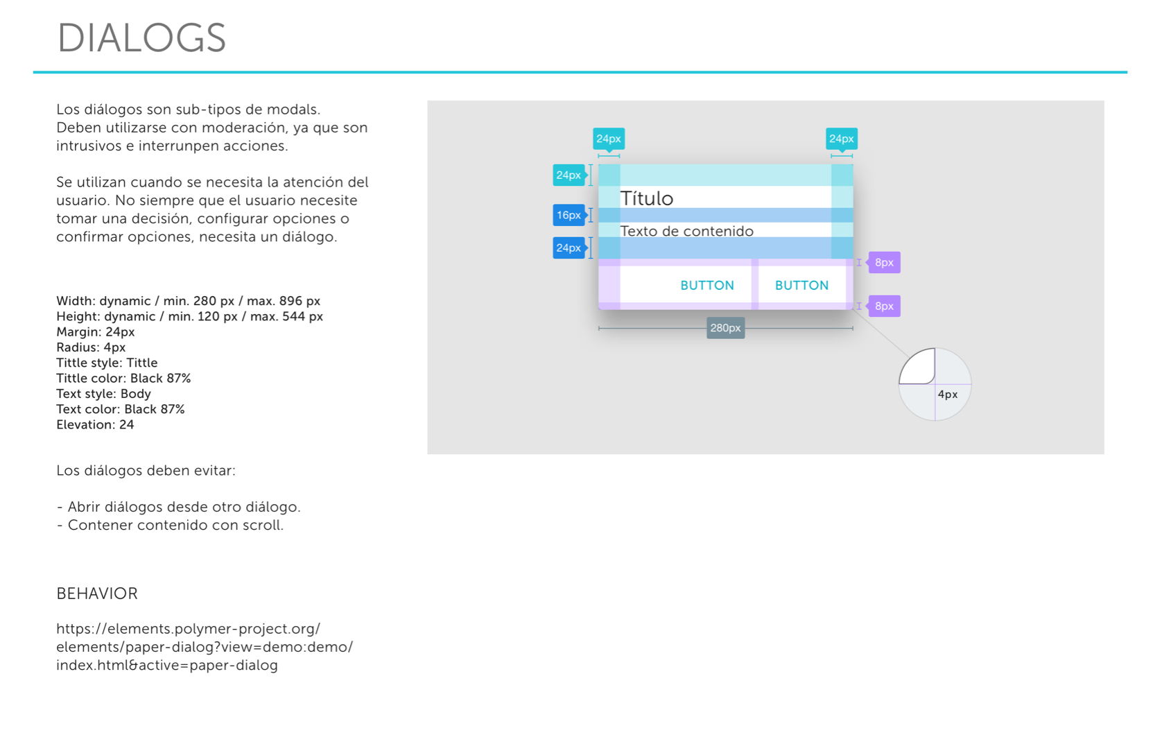
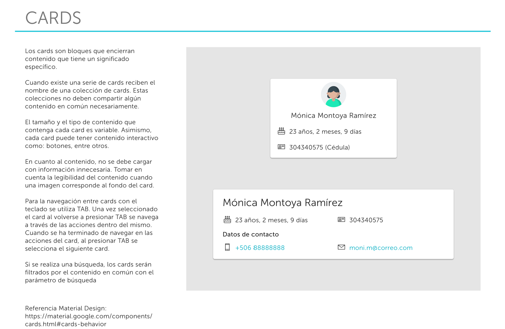
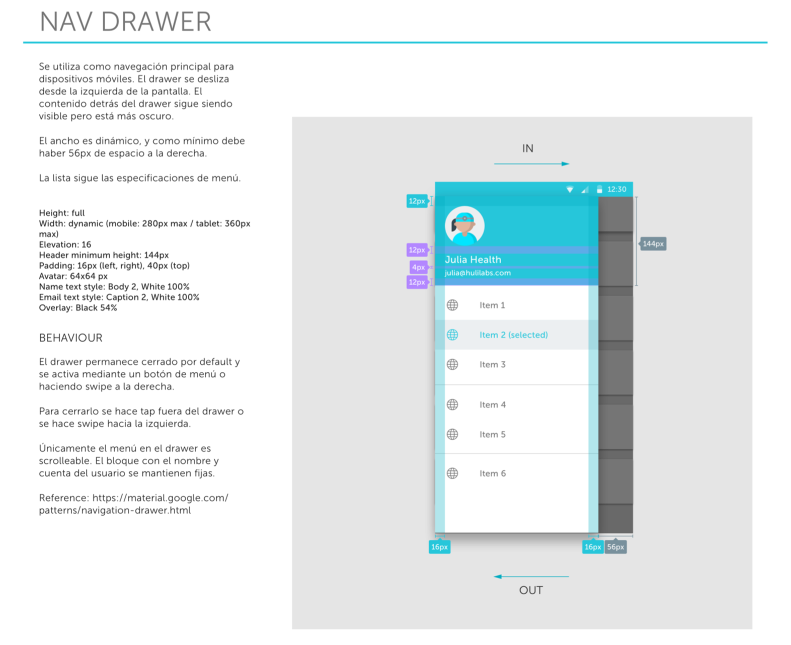
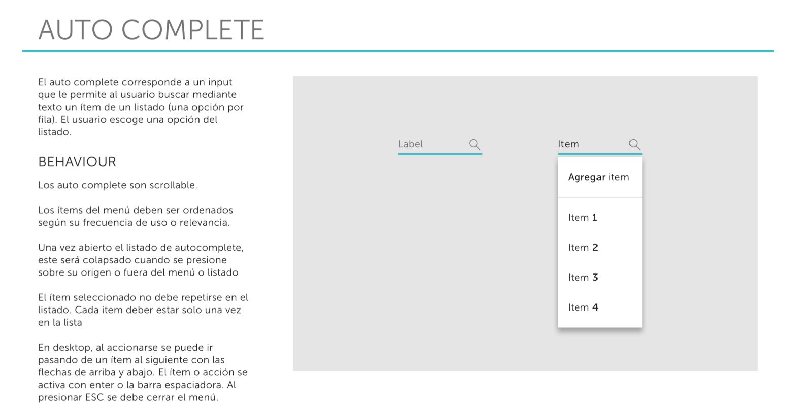
This is a preview of our design documentation to develop the System.
Outcome
- Reduced production and operational costs
- Minimize design and development time
- Improved team efficiency
- Improved platform consistency
- Helped to scale the team and the platform
Project Learnings
Collaboration is key
This was a team effort, all the company was involved and engage. We asked for feedback, we tested, we iterated and improved together.
This was a team effort, all the company was involved and engage. We asked for feedback, we tested, we iterated and improved together.
It has to be flexible
The system should give team members enough freedom to contribute yet stay within the standards.
The system should give team members enough freedom to contribute yet stay within the standards.
It is a new product
It will evolve. We need to be prepared for changes and maintenance.
It will evolve. We need to be prepared for changes and maintenance.