
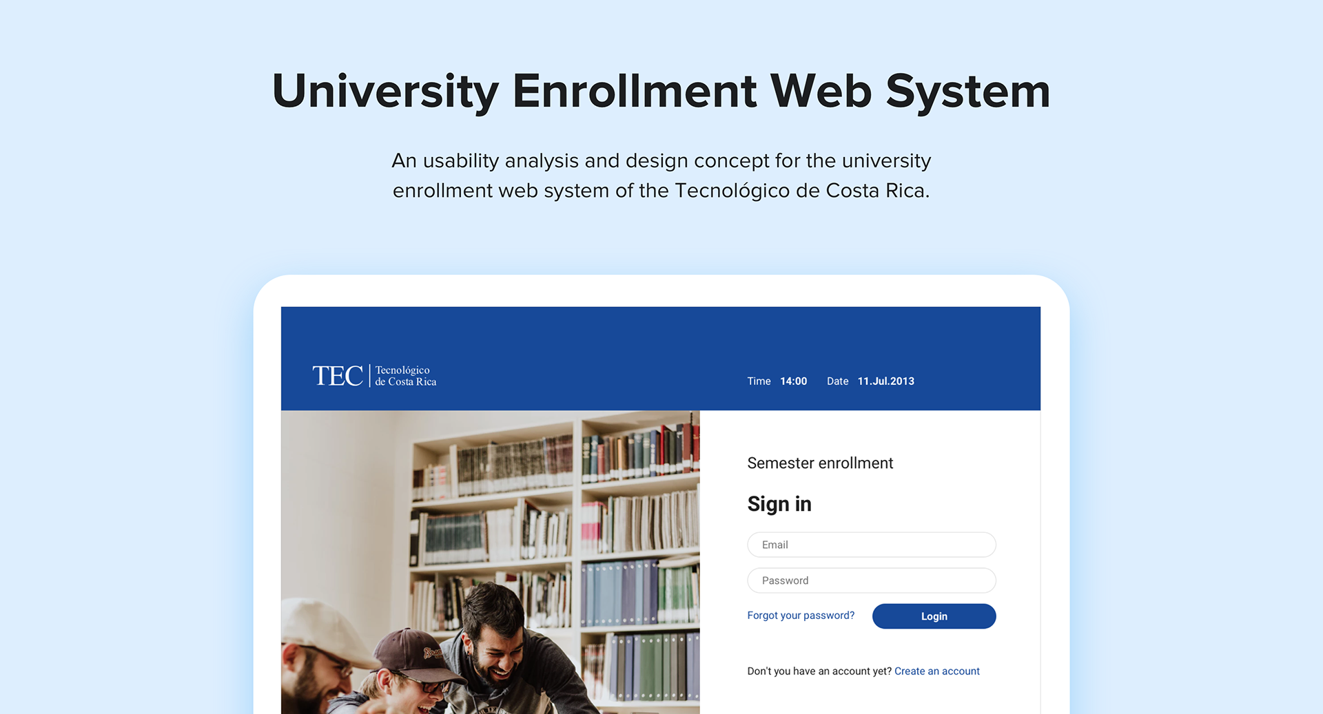
Overview
TEC is the top public university specializing in engineering and science in Costa Rica.
The main problem was how might we improve the experience in the enrollment system website to meet the needs of the students in the Tecnológico de Costa Rica (TEC).
Role
UX Designer | TEC
User research, Information Architecture, Interaction, Prototyping & Testing.
Team of 2 designers
Feb 2013 - Ago 2013
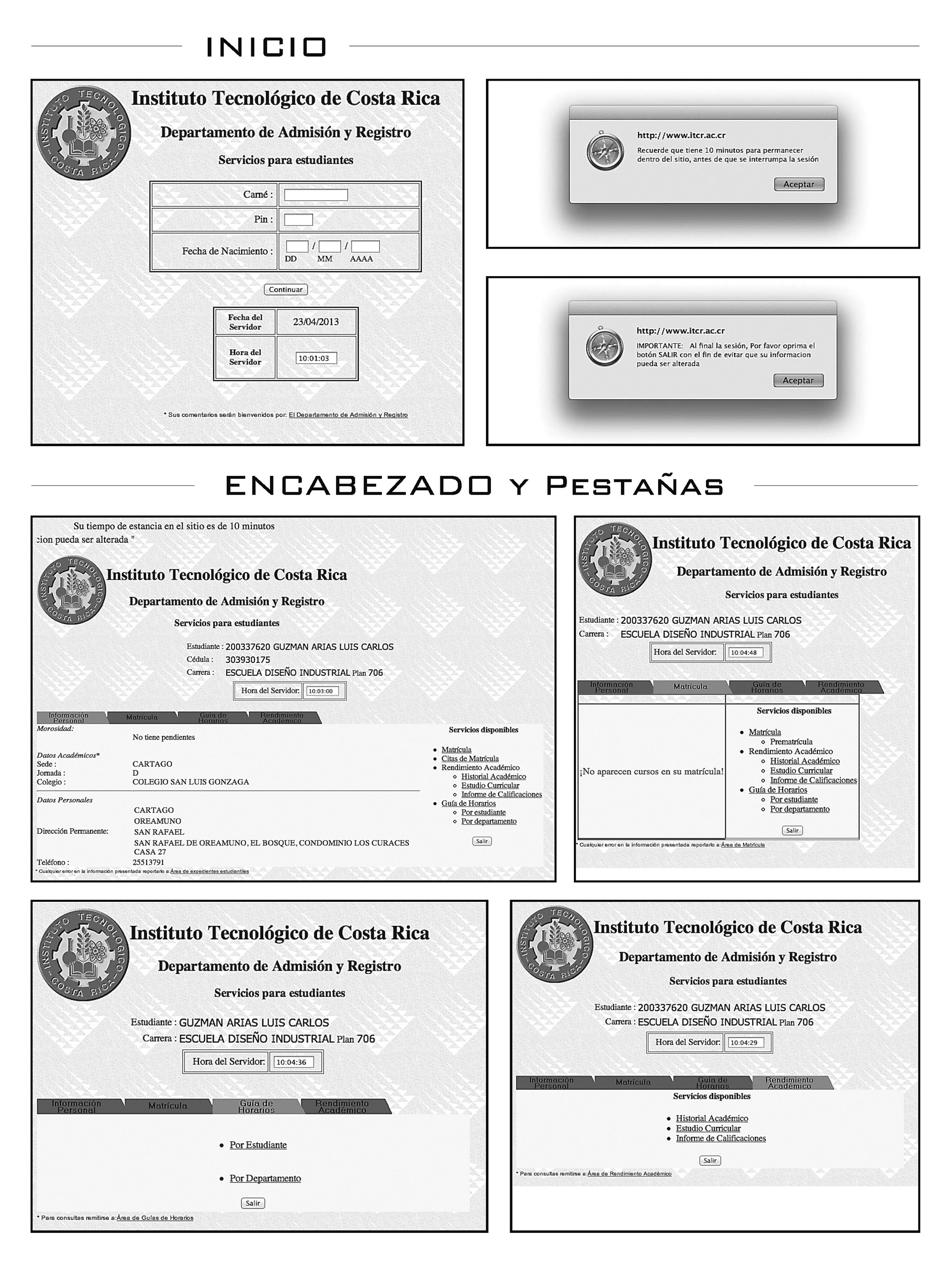
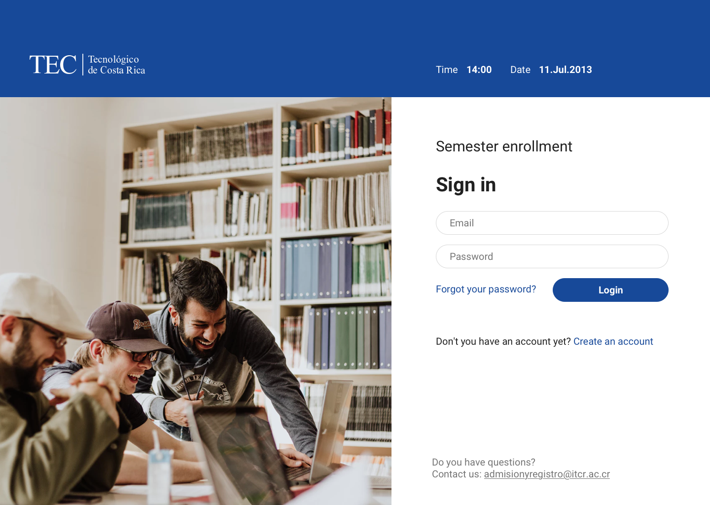
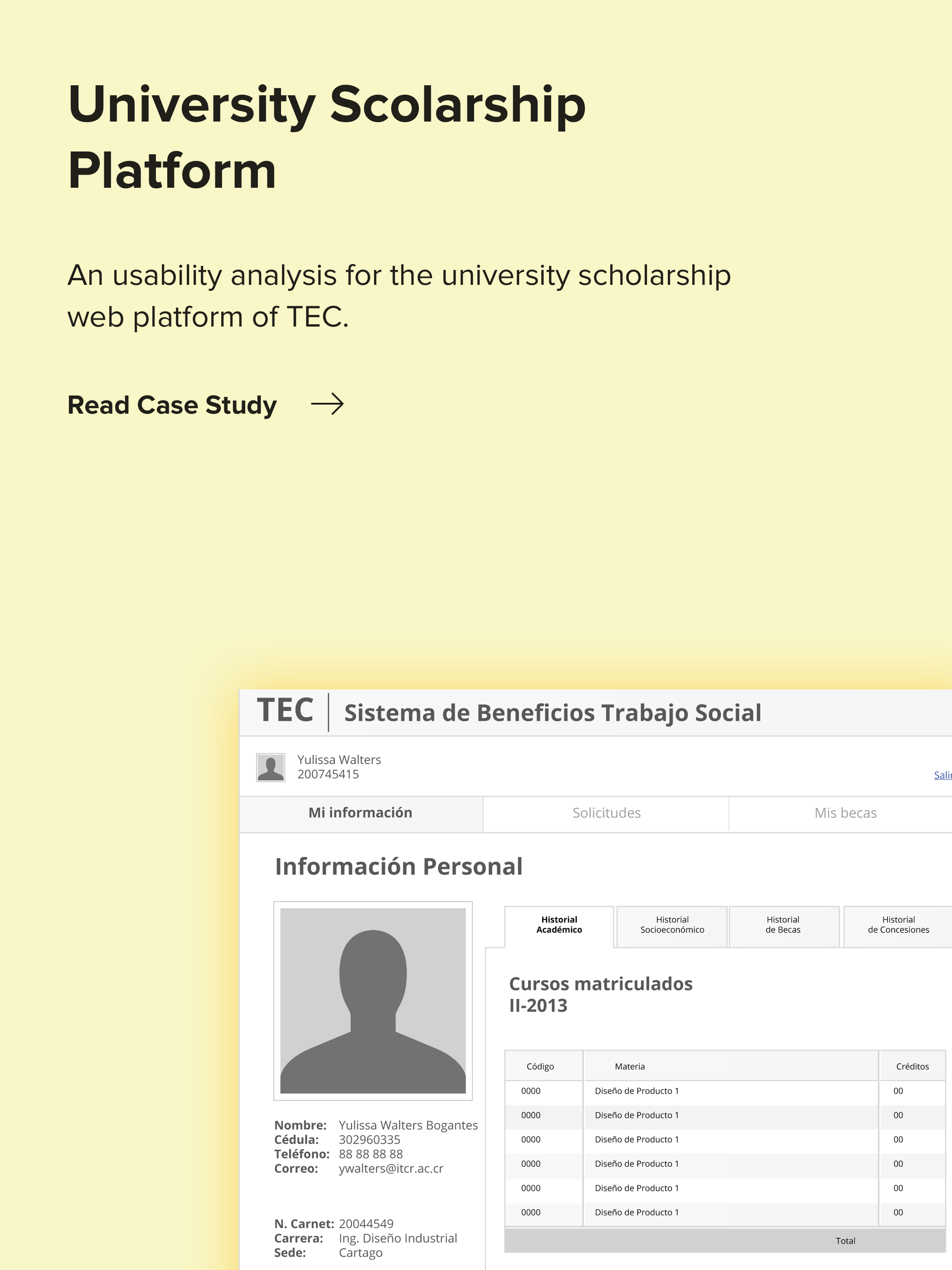
Screens of the old Enrollment Web System of the University.
The Problem
This enrollment web system was very difficult to use, especially for the new students.
The university needed volunteers every semester to help students to get enrolled in the system. The students used to make a lot of mistakes picking the right classes and doing their schedule for the upcoming semester.
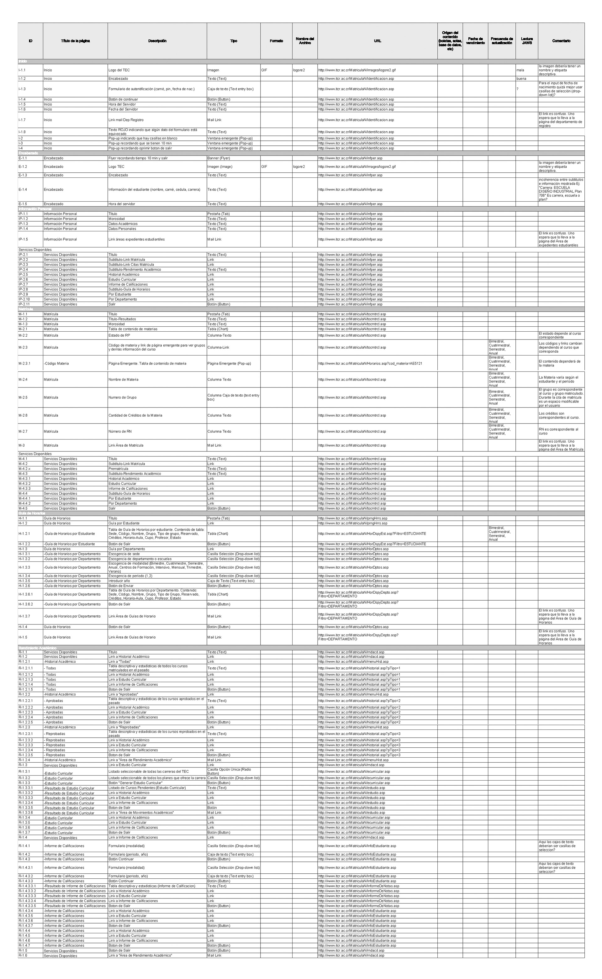
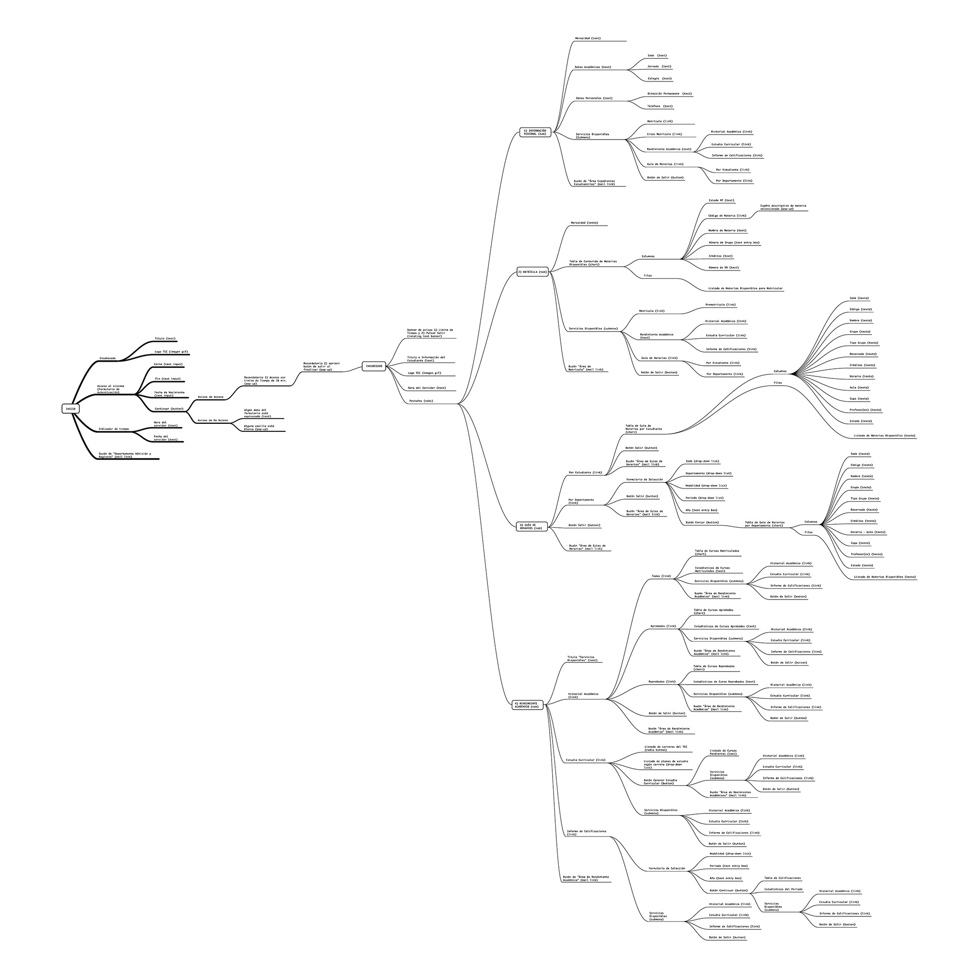
Content Inventory Analysis
The website was branched into all the sections and their content.
Information Architecture Analysis
The system didn't focus only on the enrollment of the students.
It has too many sections and actions that confused the users. It made users do a lot of mistakes and increase their anxiety.
User Personas
Two archetypes of user-personas were detected:
- Beginners: First-year students, between the ages of 17 and 20, who do not have previous experience or familiarity with the system.
- Experts: Students who have entered the system and have enrolled at least twice, they already know what the system is for.

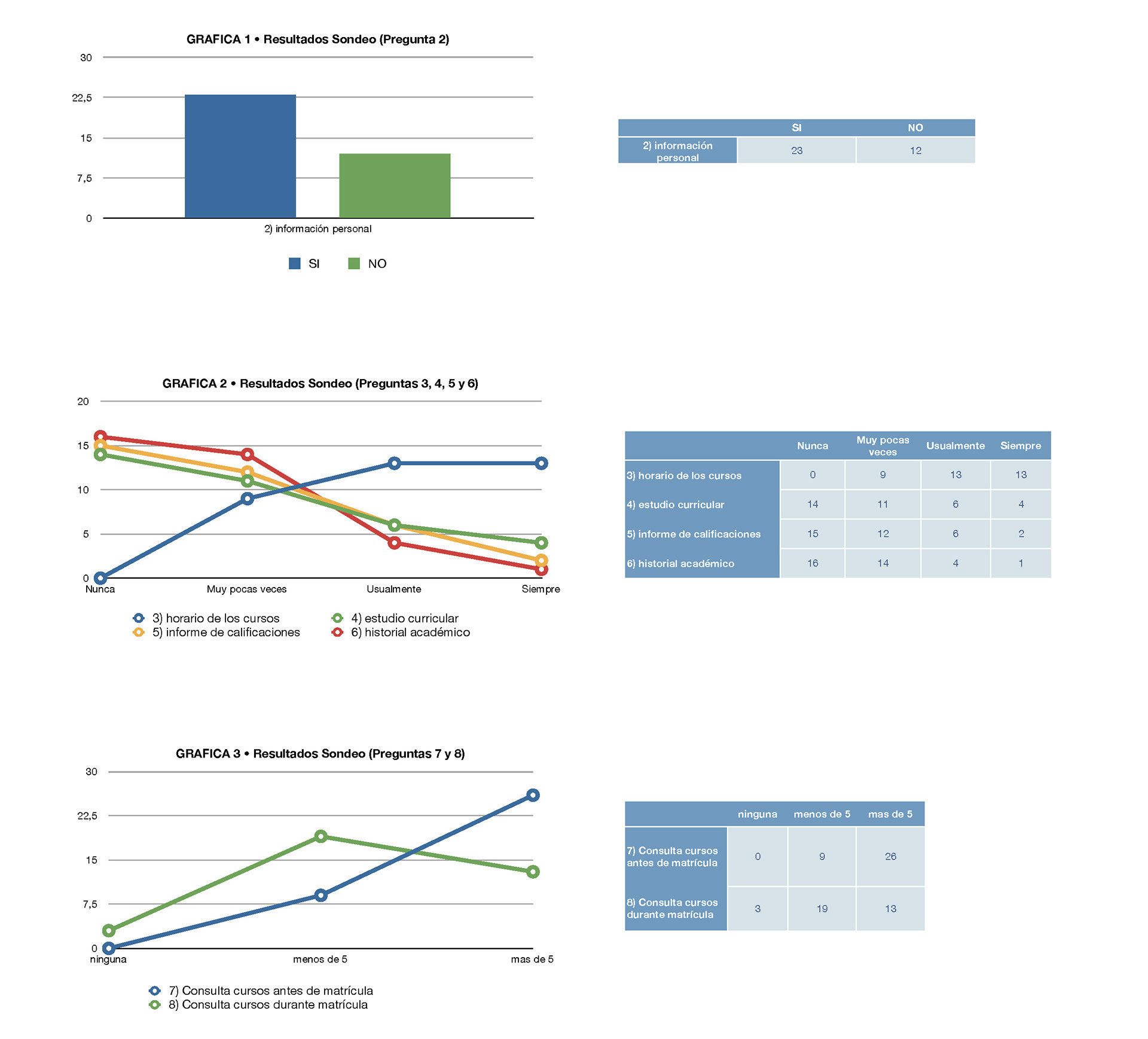
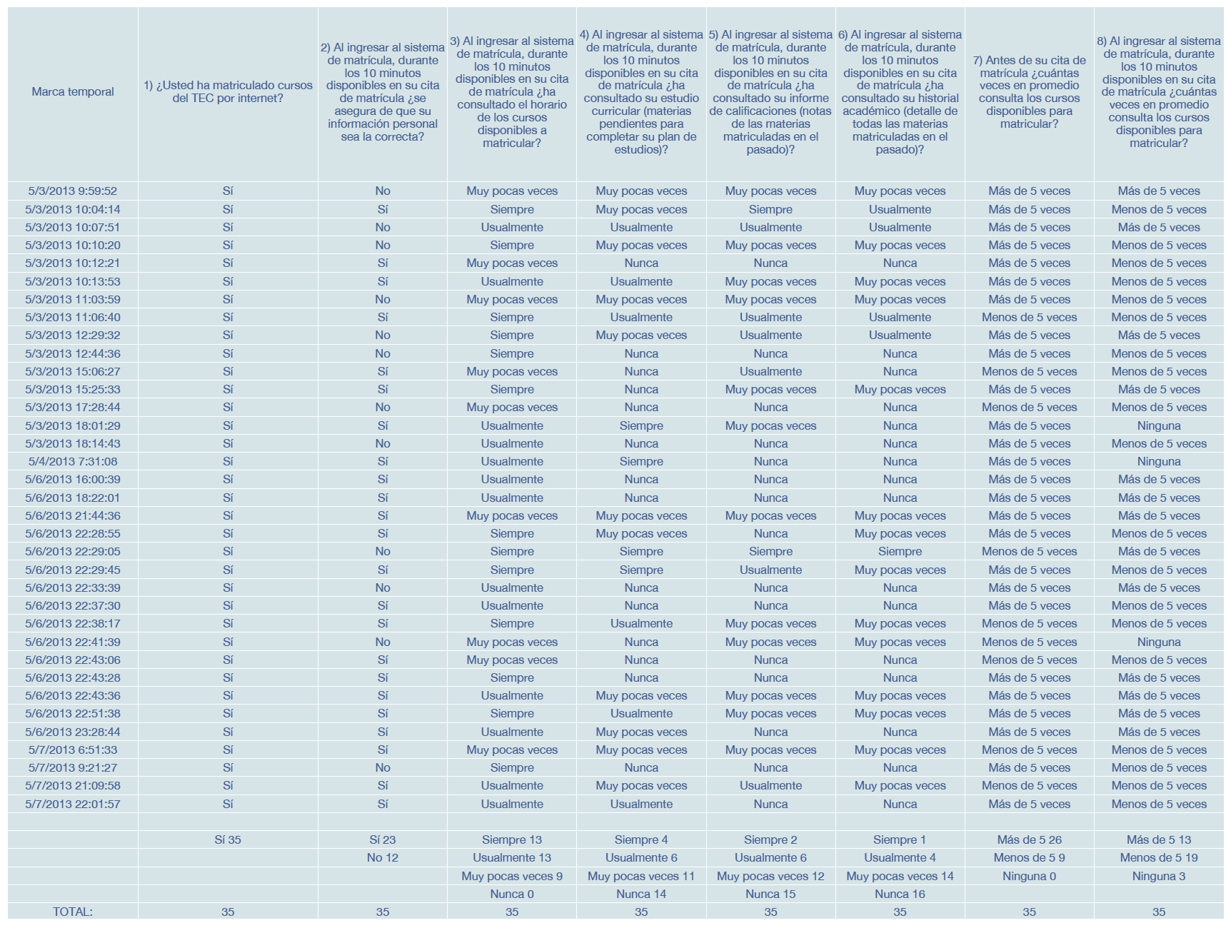
Students Survey
The survey of 8 questions was conducted to students of the Tecnológico de Costa Rica, to determine which functions of the current Enrollment System are the most used by them at the precise moment of enrollment and which were not.
New Sitemap
After the research was made from the content inventory, user personas, information architecture analysis, card sorting and surveys, we defined a new navigation. This time we reduce the cognitive load and simplify the content.
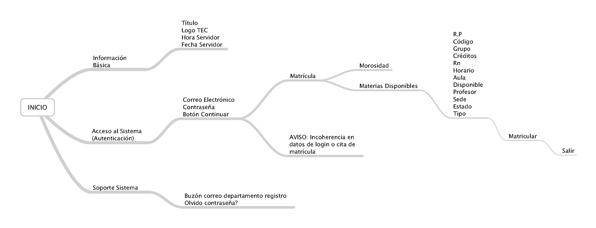
The Concept
The main objective was to reduce the cognitive load in the current platform and improve its usability.
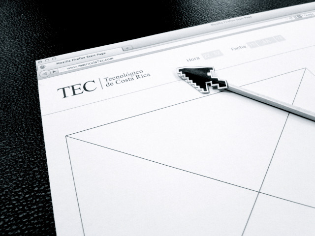
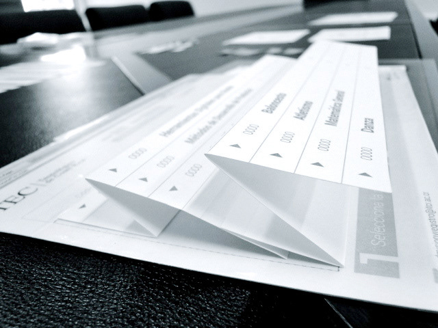
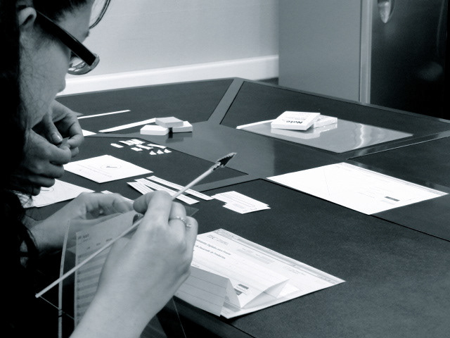
Lo-Fi User Testing: Paper Prototyping.
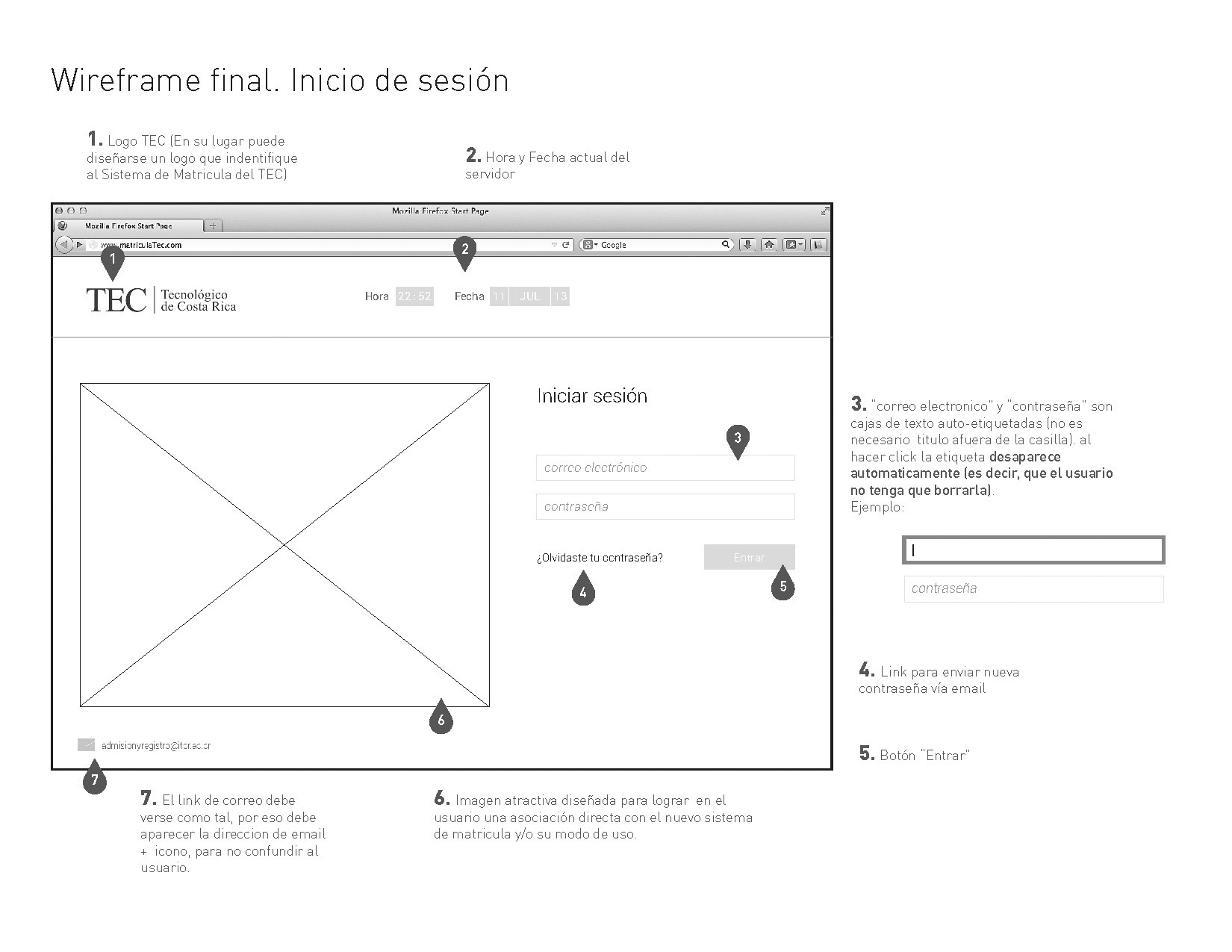


Paper Prototyping
To validate our design concept, we made a paper prototyping. It was the desktop version of the website.

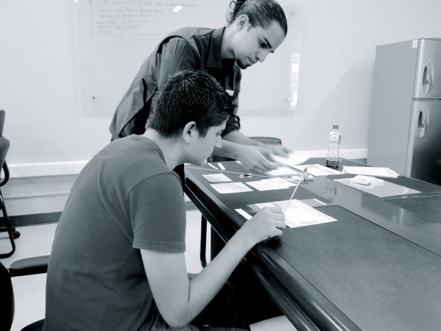
The Result: A new and fluid experience
More of the 80% of the students who were tested complete 100% of the tasks of the usability test.
Look and Feel (Design Concept)