
Overview
TEC is the top public university specializing in engineering and science in Costa Rica.
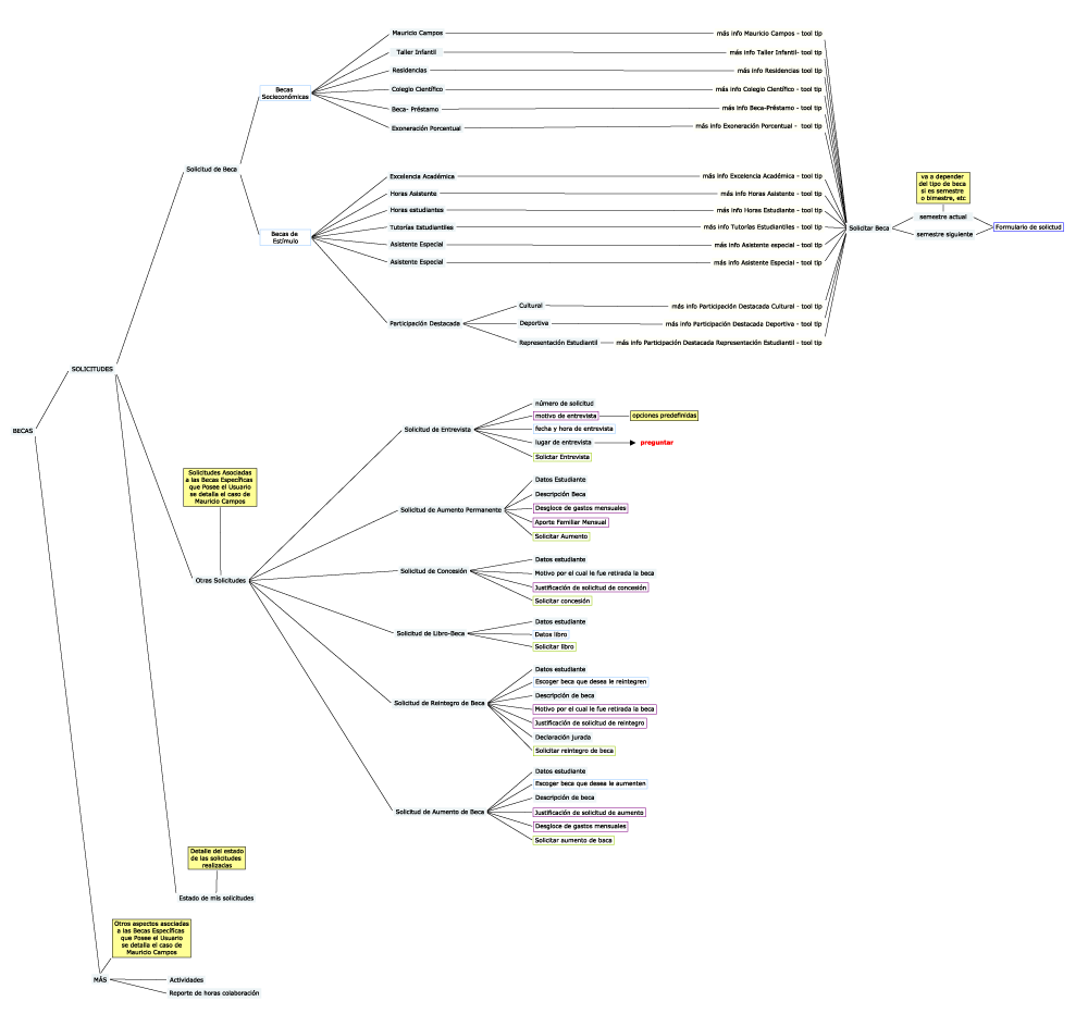
This university has a scholarship system that aims to support students with limited socioeconomic status and to stimulate outstanding students in the academic, cultural, sports and student representation.
Role
UX Designer | TEC
User research, Information Architecture, Interaction, Prototyping & Testing.
Team of 2 designers
Feb 2013 - Ago 2013
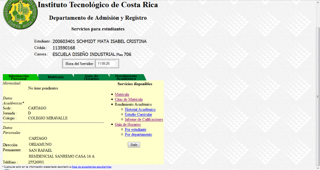
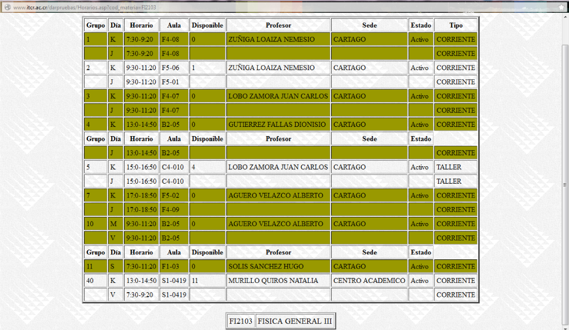
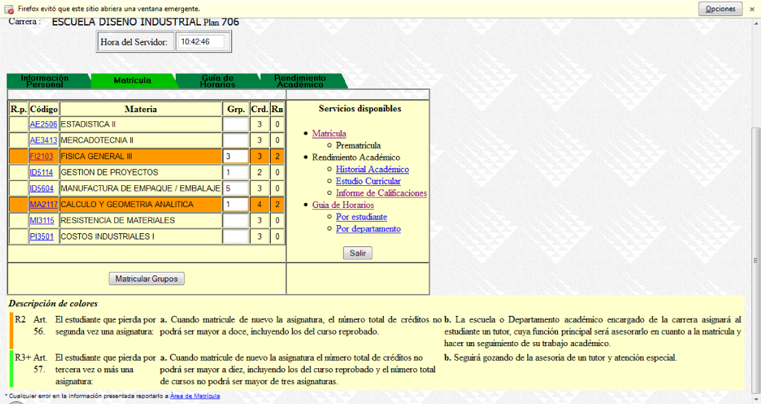
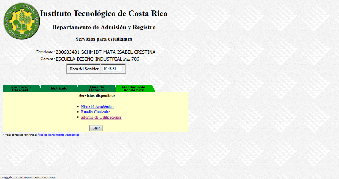
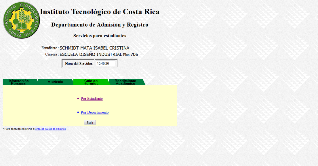
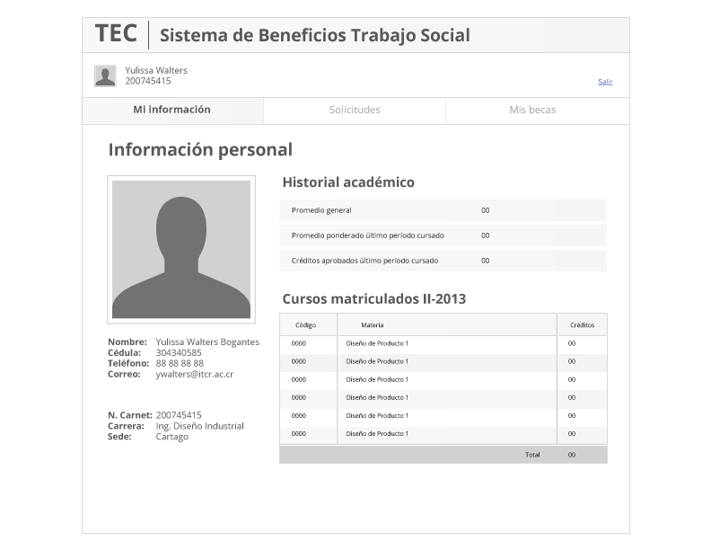
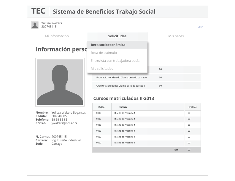
Screens of the old Scholarship Web System of the University.
The Problem
This scholarship web system was very difficult to use, the students don't know how to find the information they are looking for and it is too complicated to learn and remember.
Content Inventory
The scholarship system is show differently to each student, depending on the scholarship, or the combination of scholarships that have been assigned to them, and also it is different if the student does not have scholarships yet.
For this analysis, we focus only on the scholarships section "Mauricio Campos" scholarship.
We found nomenclature problems in the different sections of the site and inconsistencies in the use of inputs as non-editable text boxes, buttons that should not be and menus of a single option, text fields that do not indicate what information needed to be entered, image-buttons that were not clear, to name some.
There was no clear hierarchy regarding menus, forms were used based on the printed version of the forms making it difficult to understand in the digital version. Also, there was no clear feedback to the user about what is happening when he performs an action and there was irrelevant information, which confused the user.
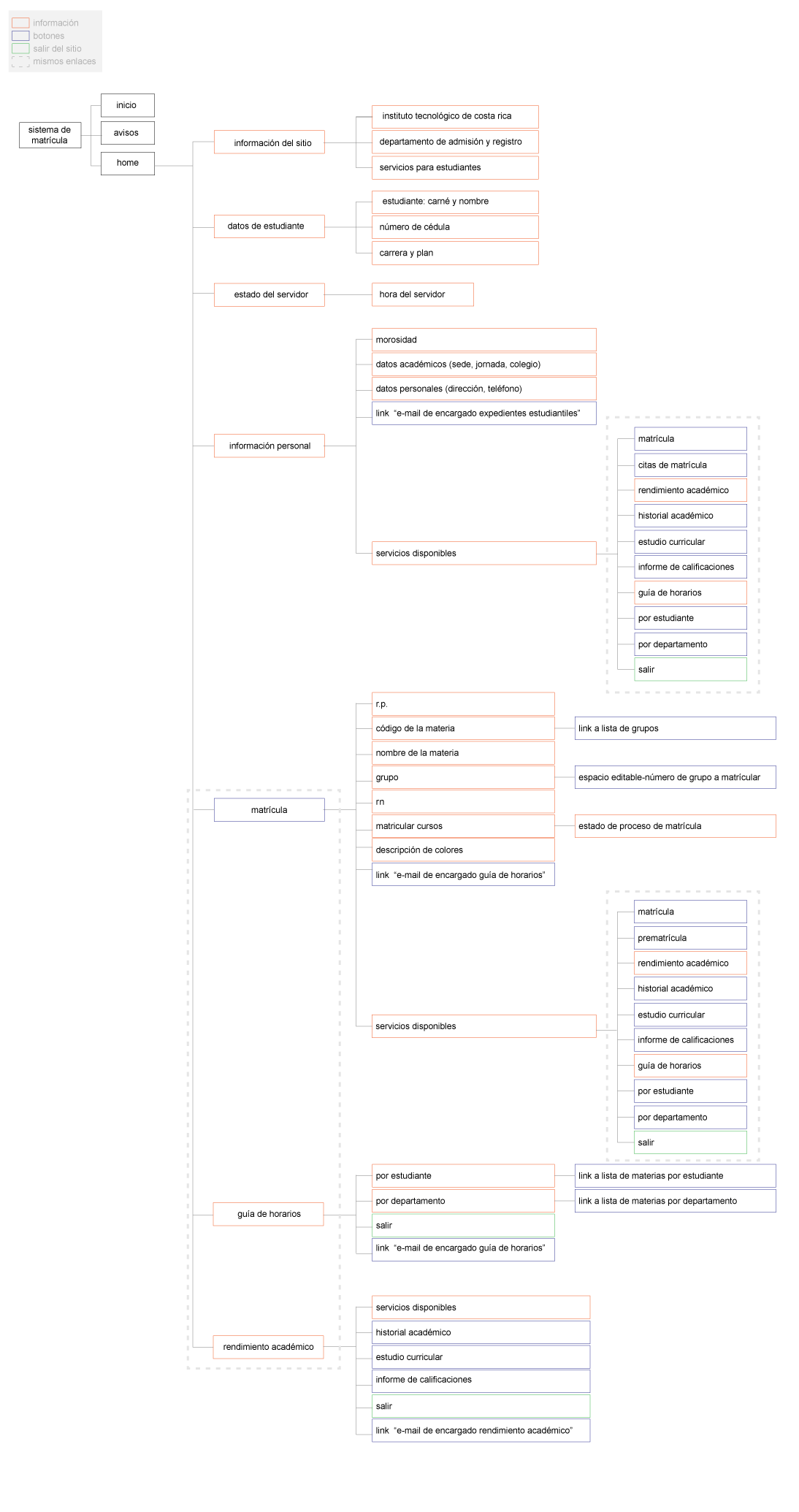
Navigation
After analyzing the navigation flow for the module, we found 3 main sections:
1. User Validation: Login.
2. Scholarship application / Status of my scholarship or scholarship application.
3. Mauricio Campos Scholarship.
User Personas
After analyzing the system, we decided to focus on the Students Module.
It was the most critical and the harder to learn.
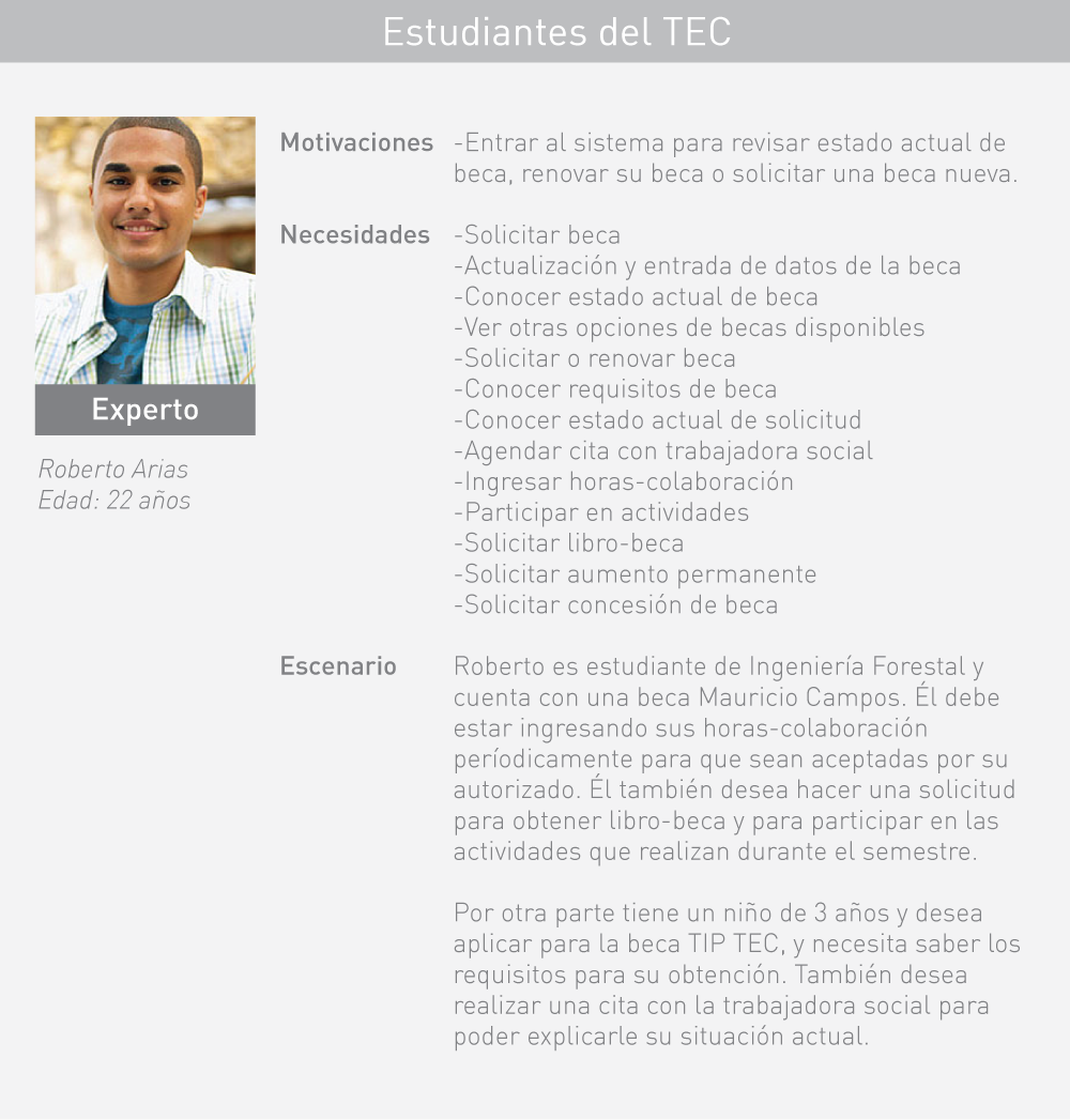
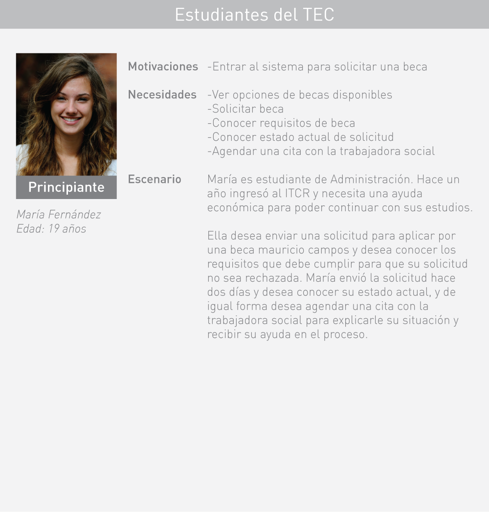
In this subsystem, the student is allowed to carry out all the procedures related to the student scholarships, as well as to follow up on their applications and to know the status of the scholarship or the scholarships assigned to them.
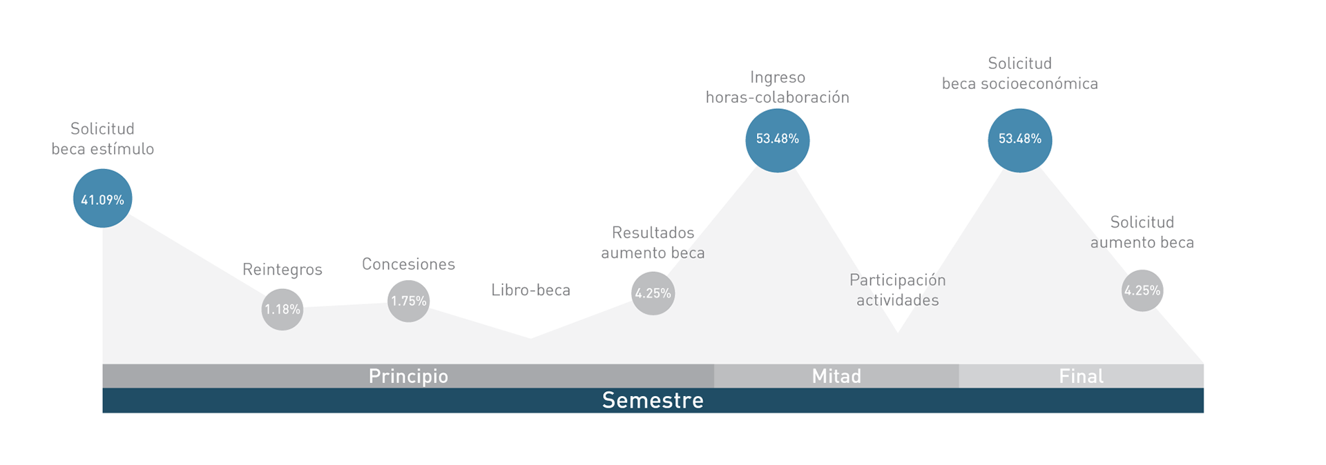
Traffic Analytics
In this case, the traffic analytics for this system was very important to determine, depending on the season of the year, which section was more important and what kind of information should be easier to access.
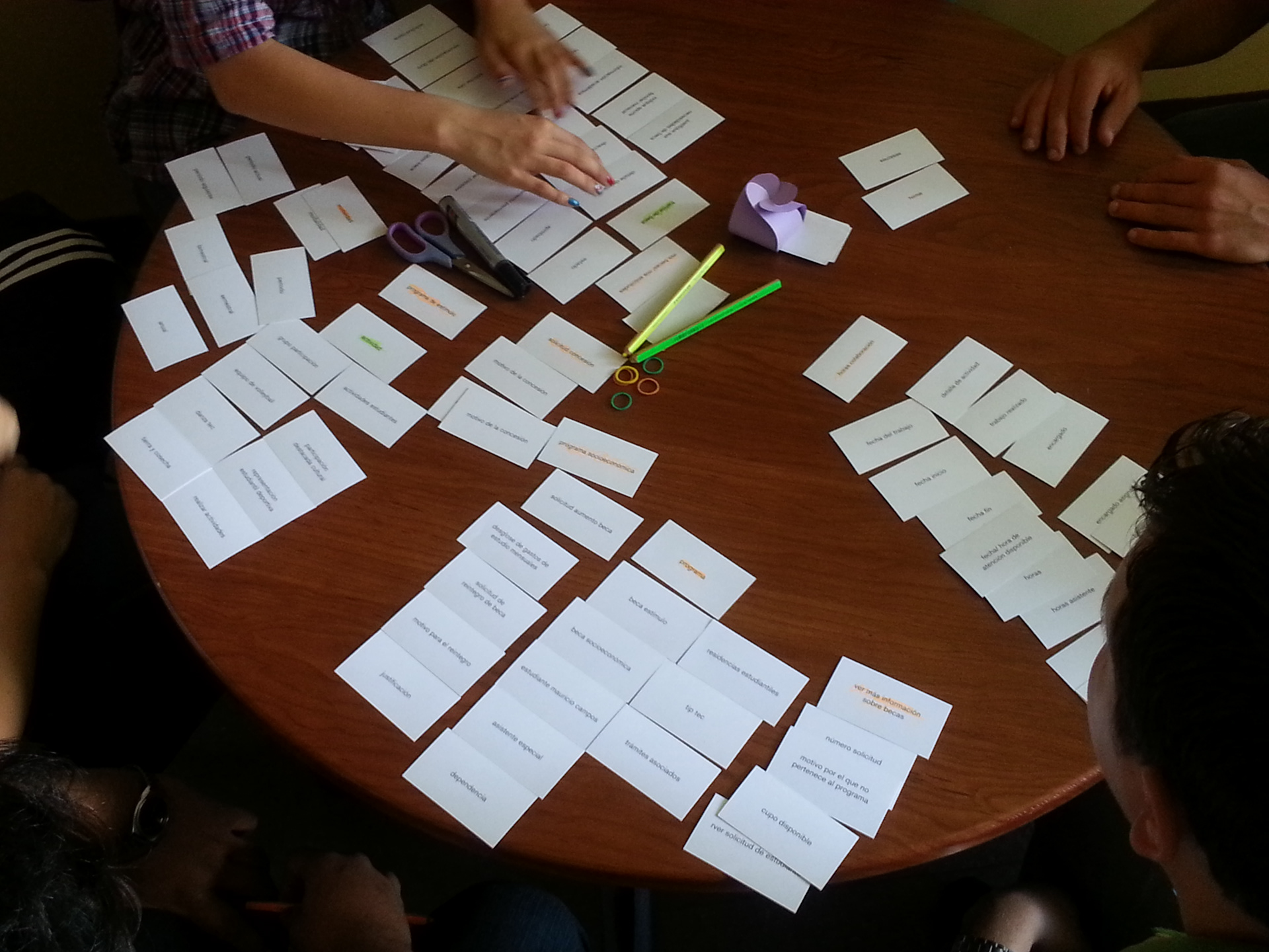
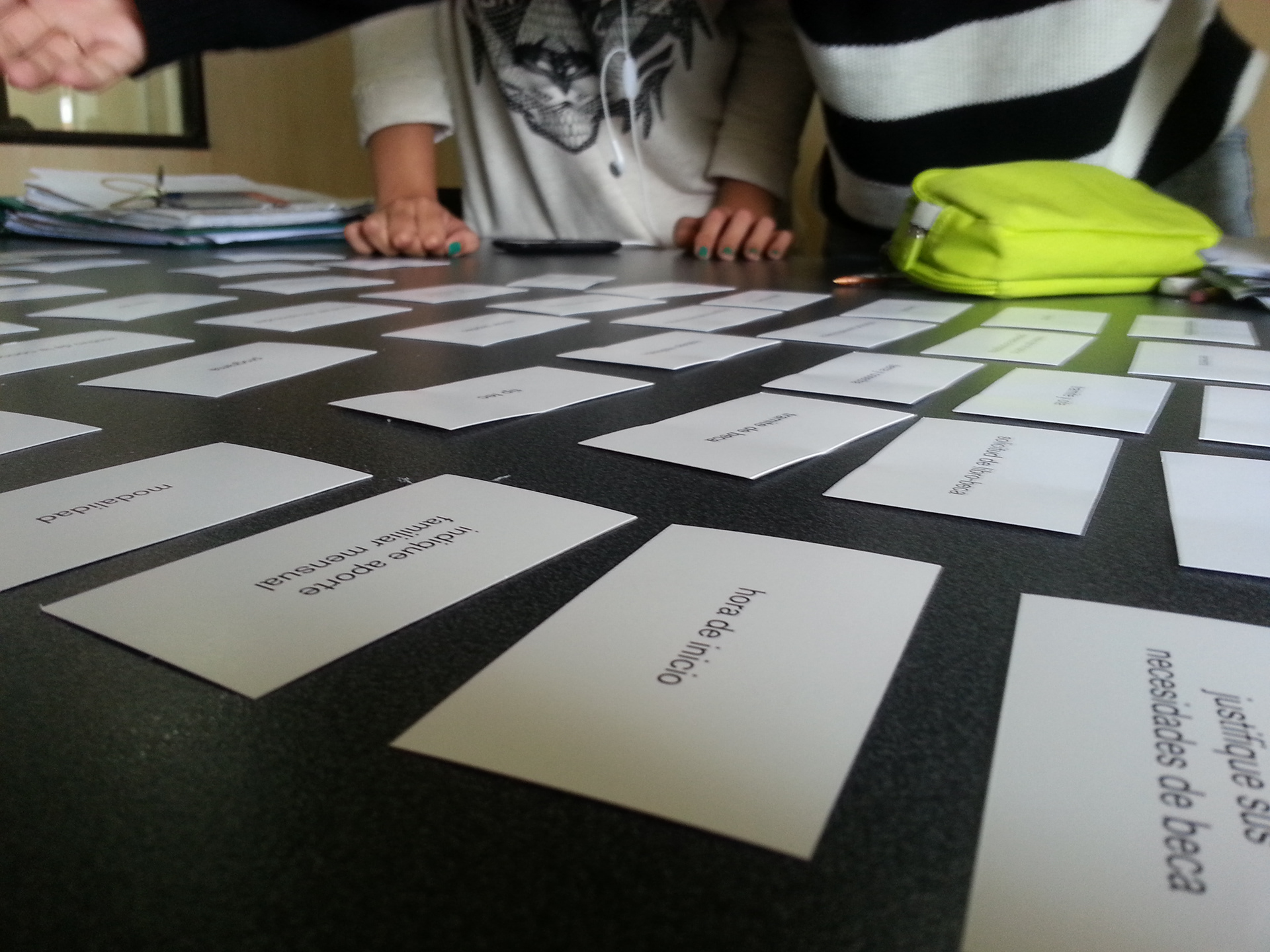
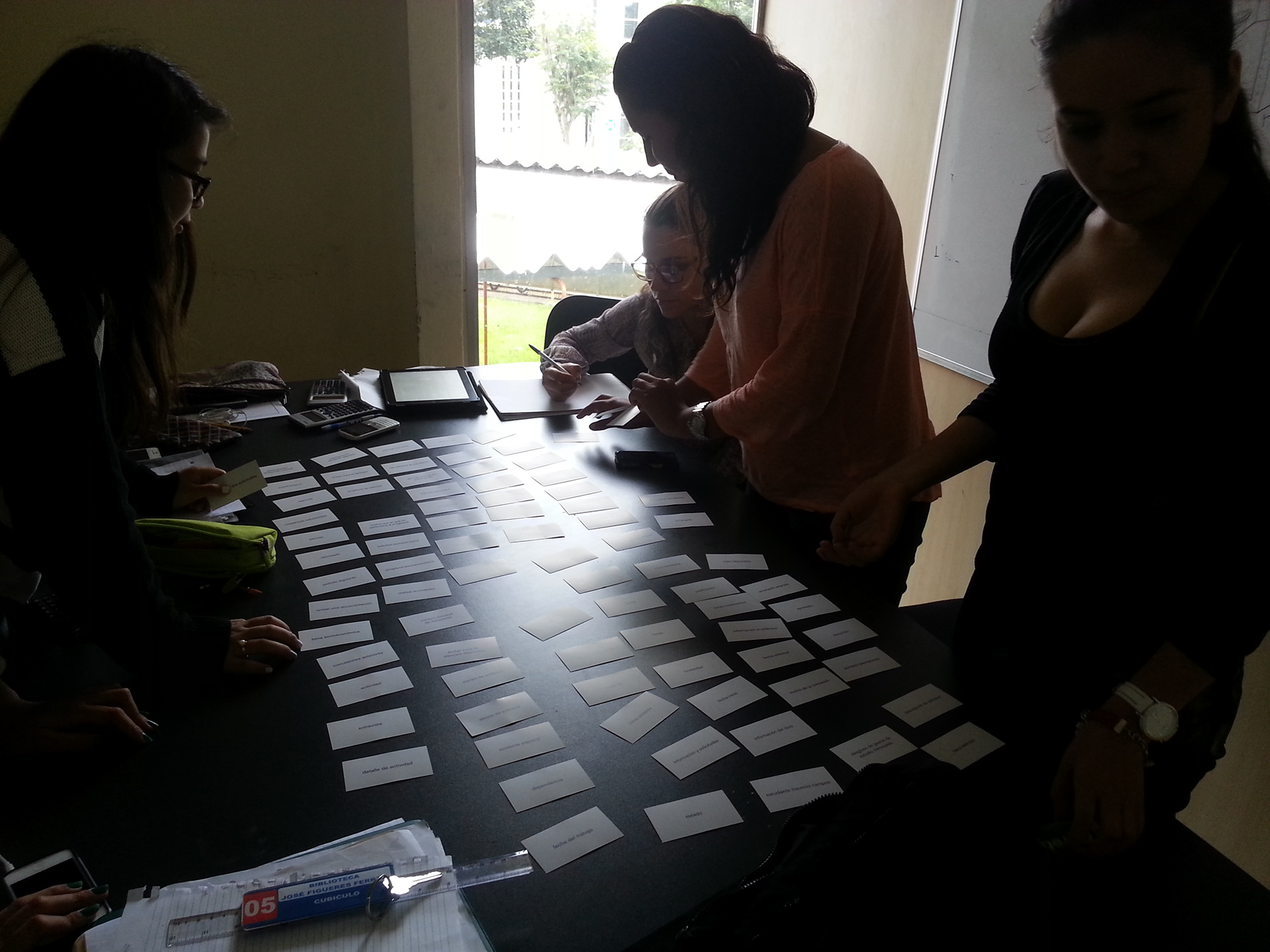
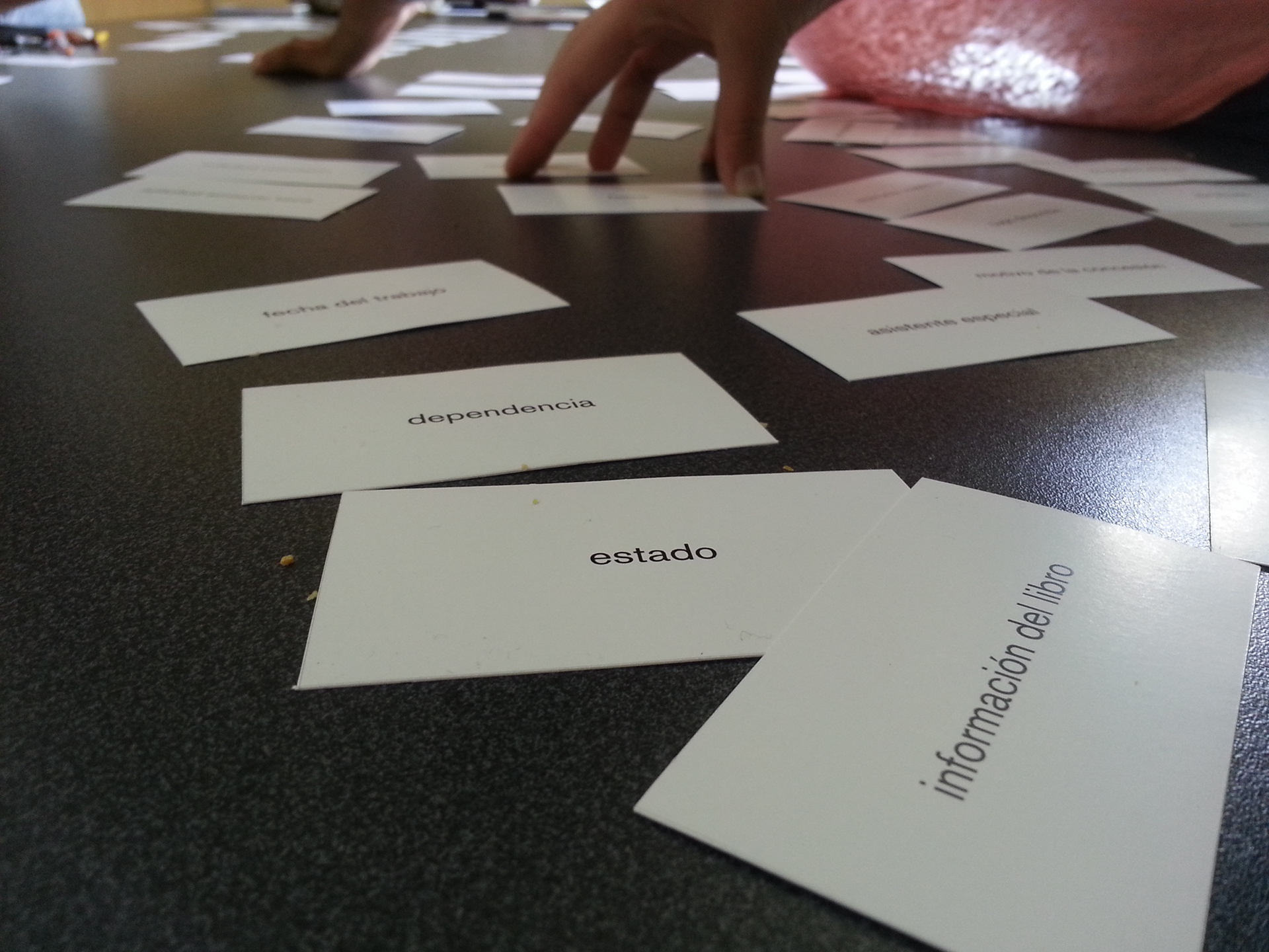
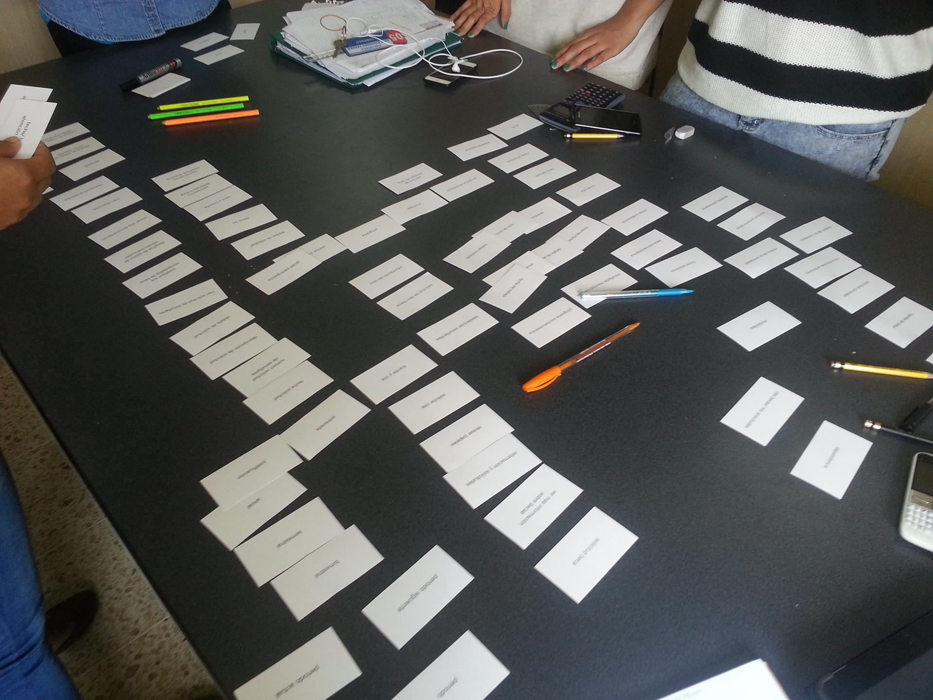
Usability Test: Card Sorting
The card sorting was made to observe and understand how users group and associate with each other a predetermined number of cards labeled with the different categories of the website.
We discovered problems on the terminology, names used to identify sections and the types of scholarships they could apply for. There was some terminology in a different language, which was a barrier for some students that didn't know this language. Also, there were some sections that didn't have any relation to the scholarship topic and the focus of the website.
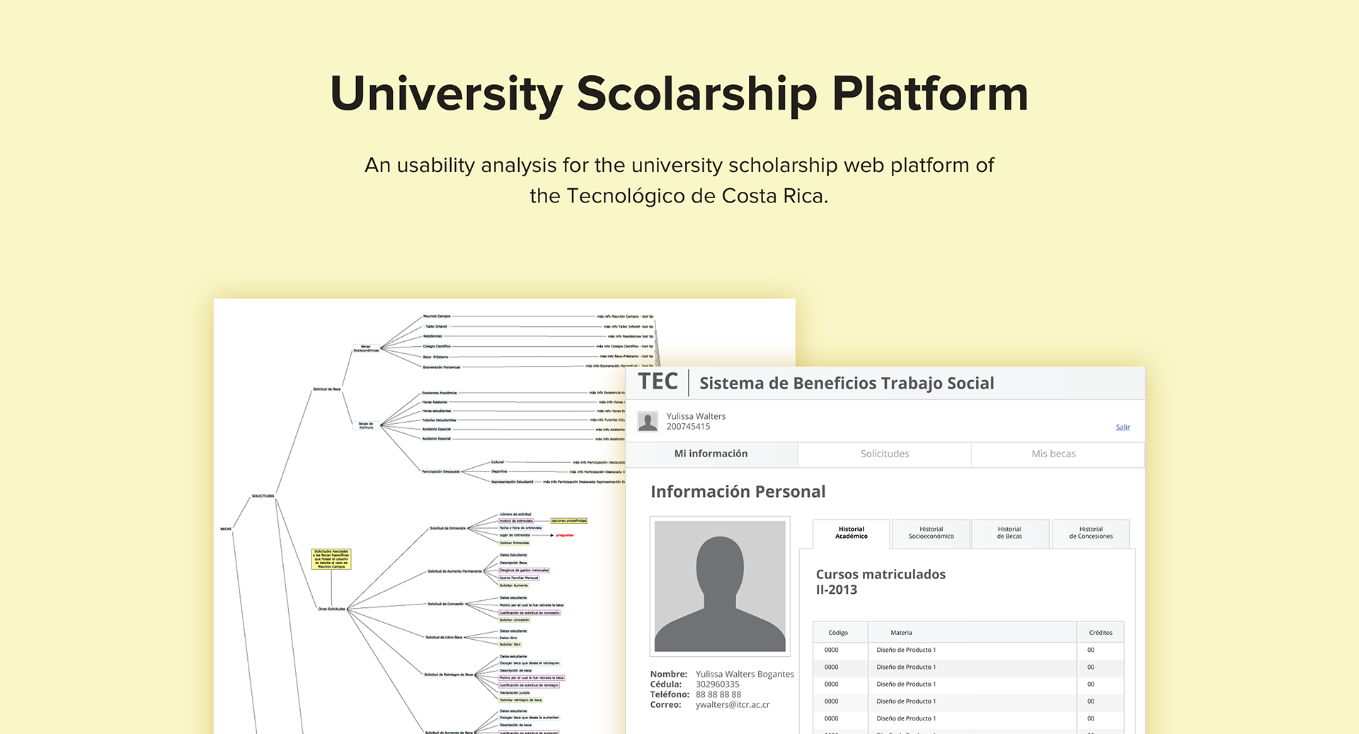
Dendrogram
This is the diagrammatic representation of the hierarchical clustering. It illustrates the arrangement of the clusters produced as a result of the Card Sorting.
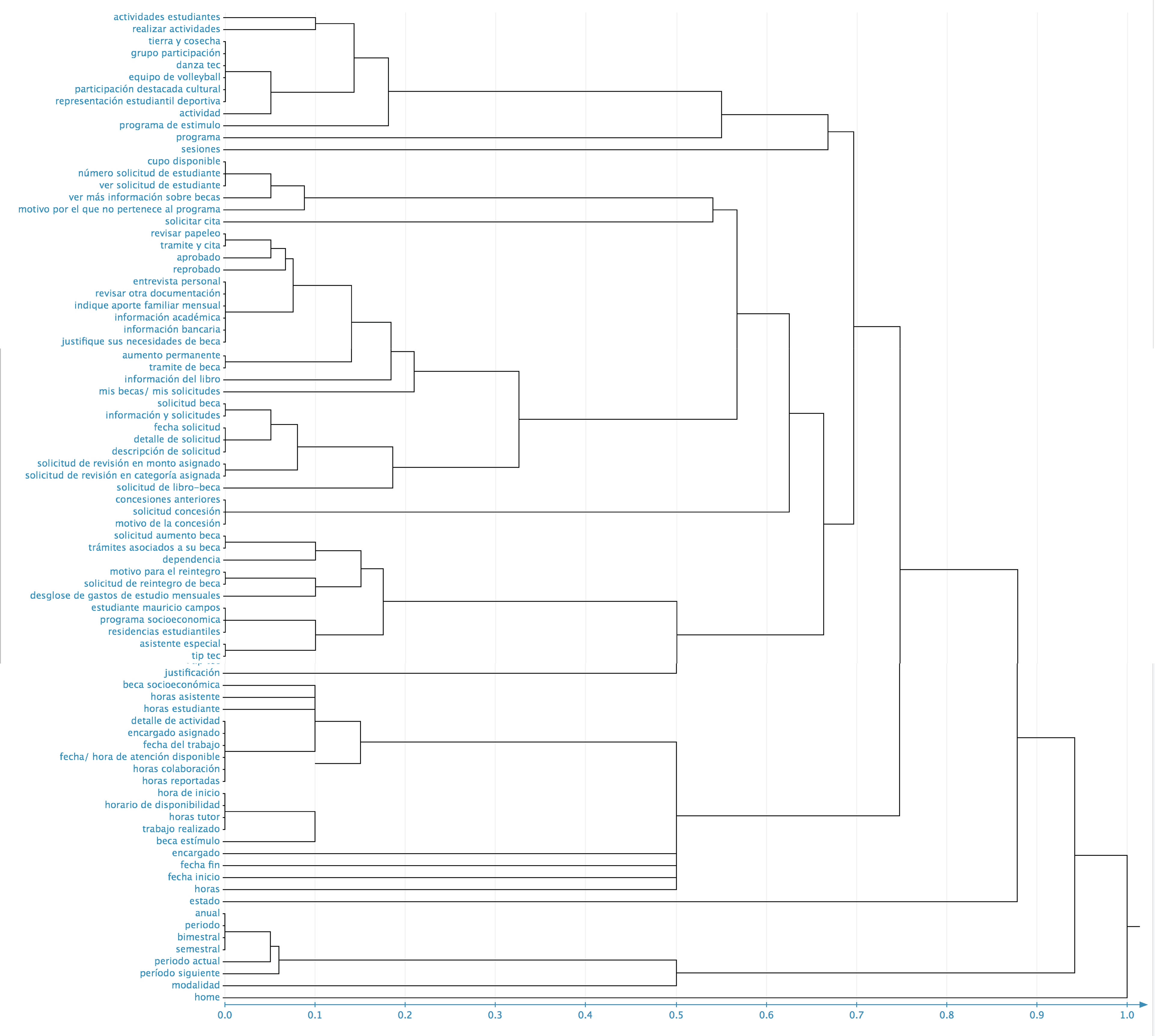
Final dendrogram.
New Architecture Information
The proposal for the new architecture information was based on the results of the different analysis and user validations made. This new architecture proposes a better hierarchy and nomenclature understandable for the students.
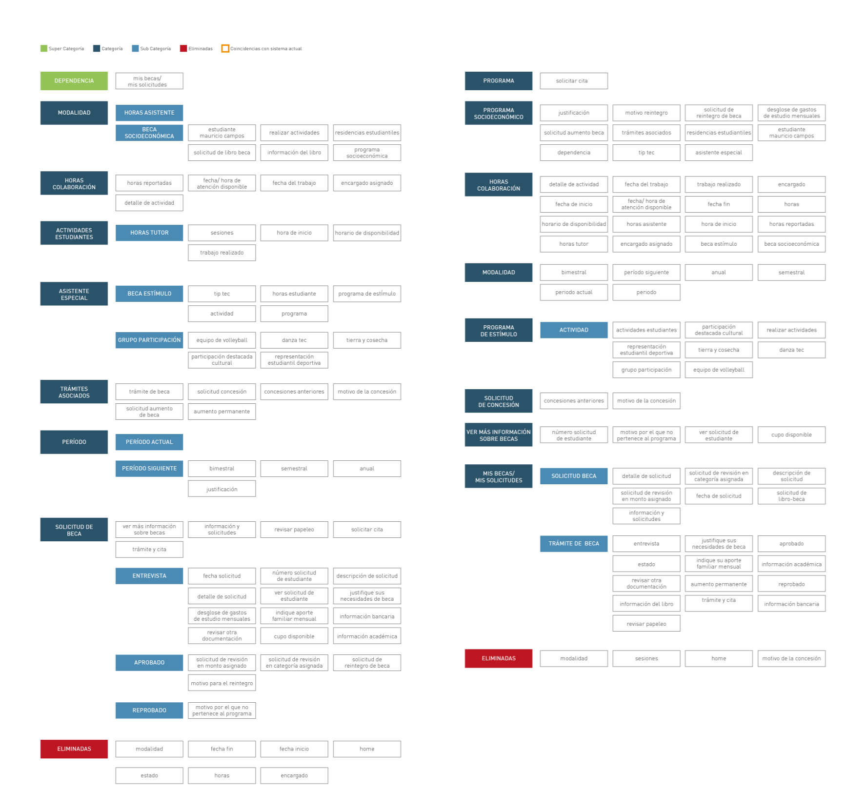
Card sorting results for experts and beginning users
The Concept
It was important to reduce the cognitive load in the current platform and improve its learnability.
Lo-Fi User Testing: Paper Prototyping.
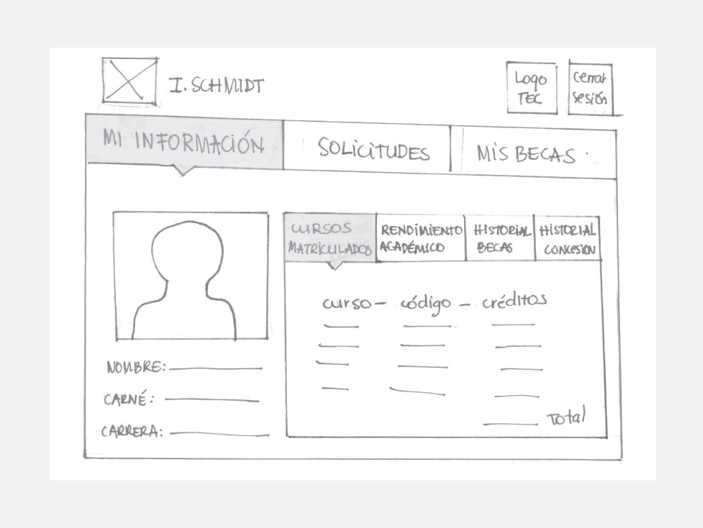
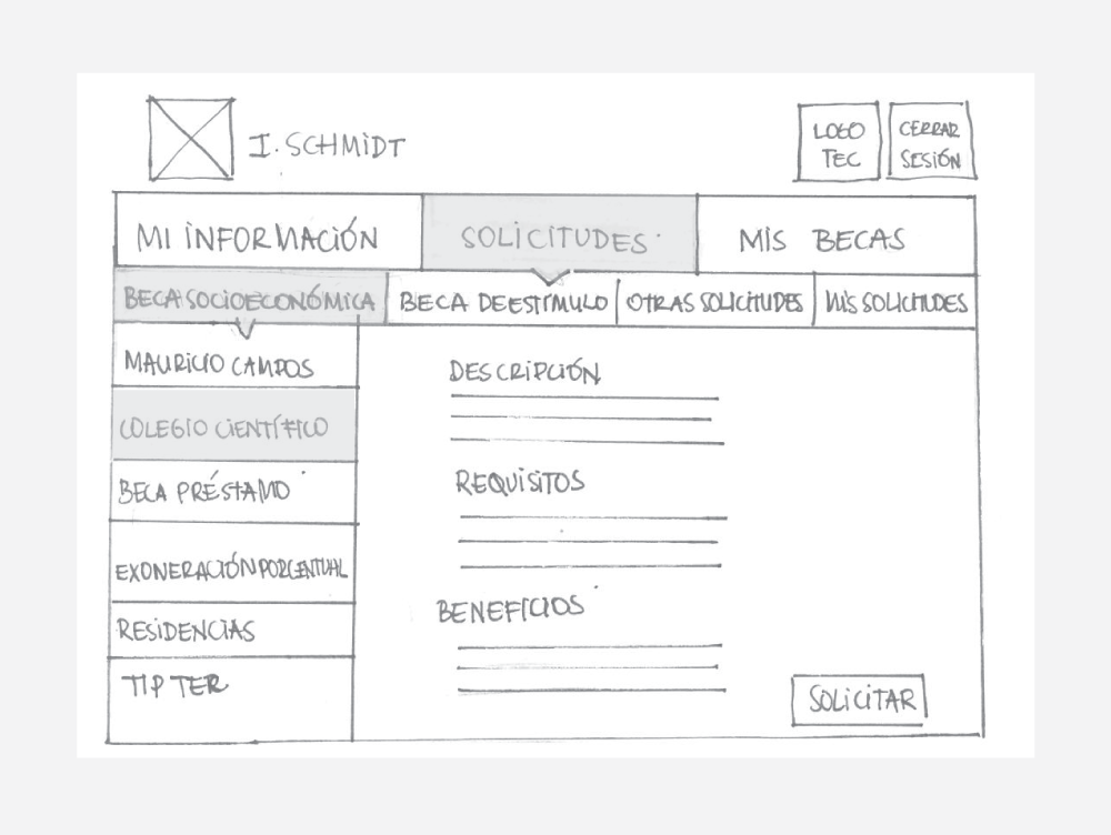
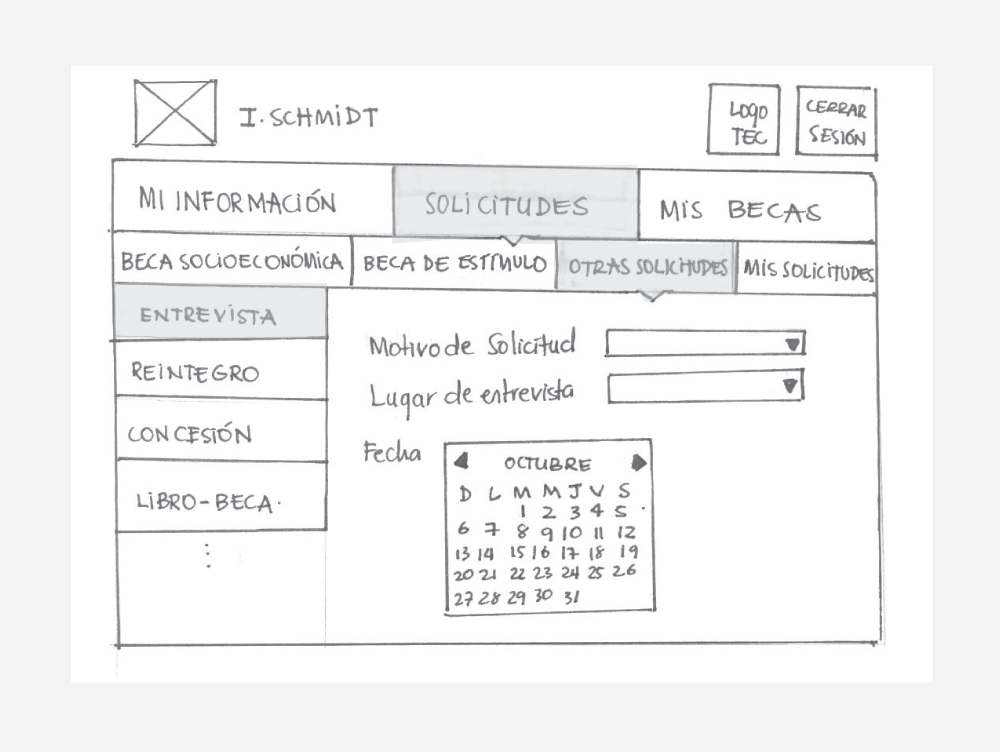
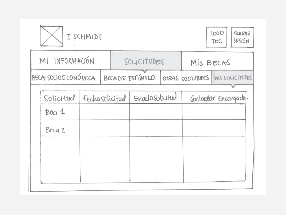
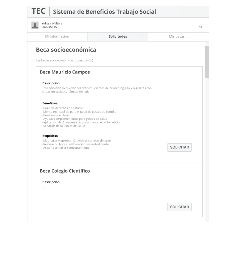
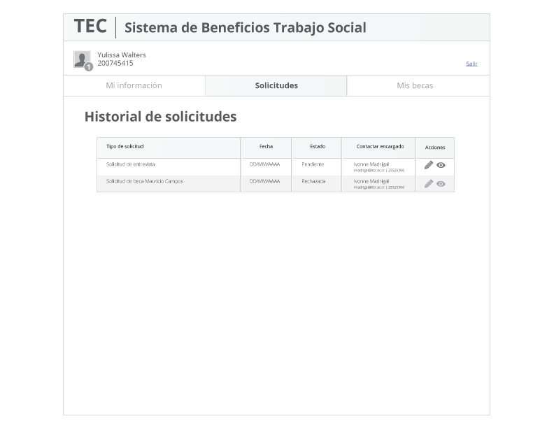
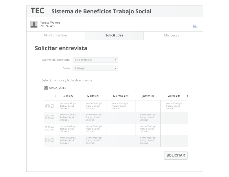
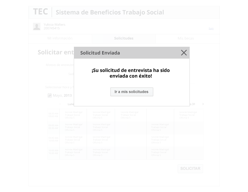
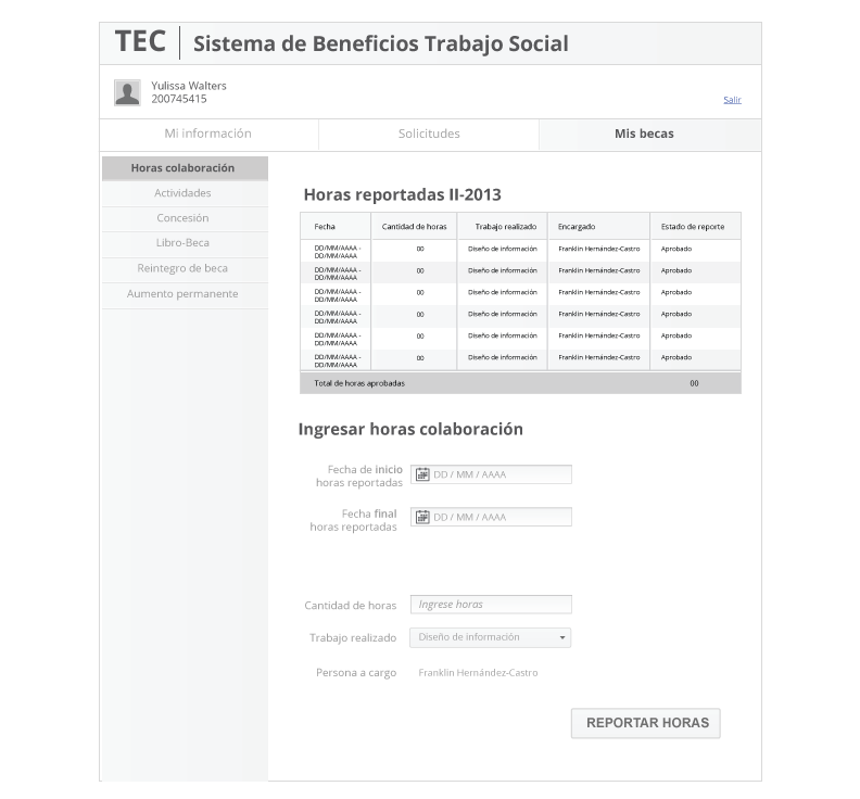
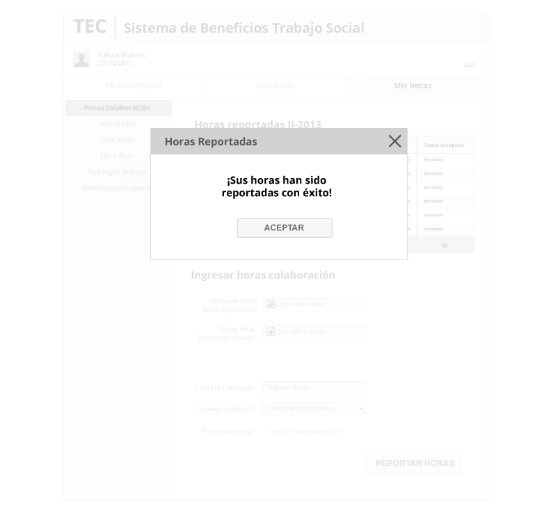
The Final Result: Wireframes
After we validated the information architecture and low-fi concepts, we began digitalizing designs.
Project Learnings
Simplicity is strength
As UX Designers, we must remember the humans in front of the screen. Our primary goal is always to understand the user, their problems and after that come up with a design that solves it.
As UX Designers, we must remember the humans in front of the screen. Our primary goal is always to understand the user, their problems and after that come up with a design that solves it.
Always validate
Validate with users in every stage will give users the answers to their problems and the best approach to solve them.
Validate with users in every stage will give users the answers to their problems and the best approach to solve them.